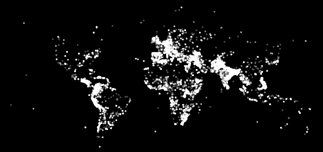
It’s incredibly sad that we can basically paint the map of our world just by using the locations of all terrorism acts since 1970. The brightest parts of the map show the areas of the world that have to deal with so much tragedy. The darkest parts are ‘safe’ because so few people live there.
The map was created by Data Hacker using data from the Global Terrorism Database. Each point is a terrorist attack from 1970 to 2012. Data Hacker writes:
This visualisation I made a long time ago just got really popular in the last 24 hours. when I first wrote the code and loaded up the map, I was stunned. it’s so simple, but says so much about the world in a way that’s difficult for me to articulate with words. it’s been my mission since then to shift perspectives by combining art and information.
You can expand the map below to see the points in clearer detail.

