Today at Google I/O, we were introduced to a new design language called Material Design. It’s Google’s first design manifesto, and within it lies a message about how the company sees its users interacting with everything from watches to cars. Here’s how to decode it.
How Android Will Look
Let’s start with what we can see: Google’s design team has set up a series of rules for how apps look. That includes simplifying and standardising the graphic layout of Android, from creating a palette-selection tool that pulls colours from the content of an app, to updating Google’s free, one-year-old Roboto typeface, which is now more clear and clean across a broader range of devices.
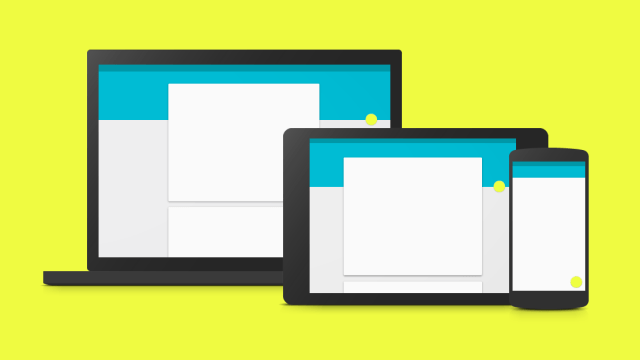
That also includes setting up a standard grid, which is more important than you’d think. Because Material Design isn’t just being used for rectangular phone and tablet screens. It’s being used for, say, a circular watch screen. And even a pair of glasses. So creating a grid that dictates spacing across all sorts of shapes and sizes is absolutely essential to creating apps that are readable everywhere.
It’s simpler, brighter, and clearer. And that’s important, because it’s going to appear on a far broader number of gadgets than any other UI in history. But more on that in a second.
How Android Will Act
So why is it called Material design, you’re asking? As we saw Mattias Duarte explain today, this new playbook is all about three-dimensionality: Thinking of pixels not just as 2D spots of colour, but as 3D cubes with depth and weight.
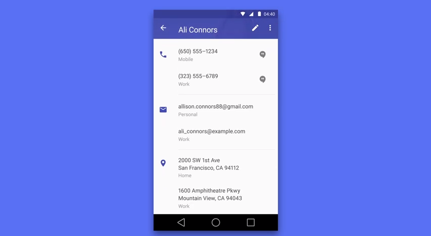
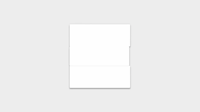
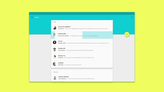
So let’s say there’s a Google Now card up on your phone screen. That window isn’t just a collection of white squares. It’s embedded with the behaviour and weight of an actual piece of cardstock, so that it acts like real cardstock when it moves around your screen.
The same goes for animated features, like shadow and perspective. Material Design renders that Google Now card as if it’s floating just over the home screen, complete with realistic shadow and depth based on the material properties of IRL cardstock.
Now, that sounds pretty different from the Flat Design craze we’ve been hearing so much about, right? Right! With Material Design, Google is introducing a careful dose of three-dimensionality into Android. And there’s a good reason for it.
Beyond Phones and Tablets
Flat design was all about getting rid of extra visual crap that cluttered up our screens. Which was great. But it also got rid of some very important details that make screens easier to read and interact with; shadows, for example.
“The fundamentals of light, surface, and movement are key to conveying how objects interact,” Google’s team explains in a manifesto of sorts available here as a PDF. “Realistic lighting shows seams, divides space, and indicates moving parts.”
By getting rid of those useless artifacts, flat interfaces made it easier for Android to look good across a huge number of phone and tablet sizes. But Material Design isn’t just a design language for those devices. It’s a language for screens much bigger and much smaller. And in some ways, it needs the three-dimensionality to make devices easier to see and interact with.
The World, Designed by Google
Google, as we know, wants to be in everything: Houses. Glasses. Robots. Thermostats. Laptops. Internet balloons. TVs. Virtually any other outgrowth of technology around — Google’s there. And with almost 50,000 employees on the books, it needs a document that each and every one of them can use as a guiding light, across all platforms and devices.
So Material Design isn’t just about tablet or smartphone screens. It’s about a systematic approach to how its products interact with millions of users. It’s about Android Wear devices, which have to display huge amounts of information on a tiny screen:

It’s about Android Auto, which has to display that information — safely! — to a user whose attention is severely compromised. It’s also about Chrome, which is as much an operating system as it is a browser, and needs to feel and appear easy to use.

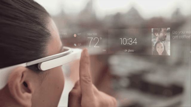
And what about Glass? Material Design has to apply there too — on an interface as small as your eye.
And those are just a few examples of how Material Design will be used; there are dozens of other devices in the works. A single design standard for all those things? It’s a tall order. And that’s probably why Material Design is less a set of specific rules than it is a framework for physics and materiality.
Think of Google as a environment you might see in a video game. Sure, it needs people and trees and objects. But before any of that, it needs gravity — the laws of physics — to dictate how all that stuff will act. Material Design is that law of gravity. As Google builds out the rest of its world with all those fun watches, cars, and maybe even a few robots, this is the system that will keep them all grounded.