All day long on the internet we hear how Helvetica was used for this or how Helvetica improved that. Helvetica Helvetica Helvetica! Well, here are a handful of designers who’d like to say a few words about another classic font; let’s get to know Times New Roman, shall we?
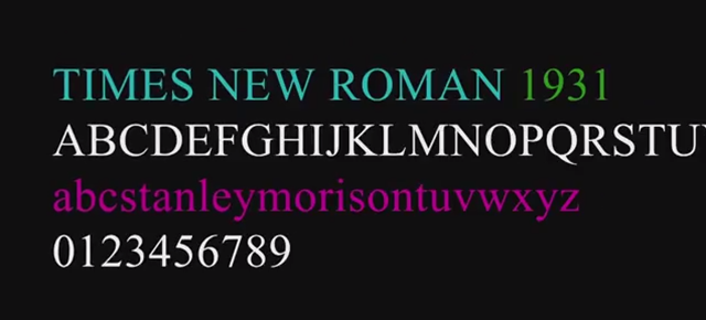
The serif typeface was commissioned in 1931 for the express purpose of making The Times, a British newspaper, more legible for readers. Now it’s ubiquitous and, depending on who’s weighing in: “robust”, “honest”, “proud”, “boring”, “contemporary”, “primarily English” or “like an accountant in a suit”.
It is endlessly fascinating and hugely endearing to hear these pros talk about the ways in which a font can influence our views on, well, pretty much anything and everything that’s written down, printed, and posted. They offer insight into just how impactful and enduring design can be — the mini-doc claims that Times New Roman is now the “most famous typeface in the world,” though I’m not sure how that’s measured and yes, it should be noted this film was produced by The Times — and display a clear, almost visceral response to the lettered form.
Their passion for type is palpable, and the whole thing is a nice introduction for non-industry folks to understand why creative decisions can matter so much. Paging Gary Hustwit — any interest in adding another chapter to your trilogy ? [It’s Nice That]