Google’s homepage is one of the most recognisable websites on the internet — if not the most. And it’s for that very reason that it’s also one of the most overlooked. So why fix something if it’s not broken? Why the hell not.
There’s always going to be room for improvement, which is why collaborative, challenge-based design blog Letters Society took it upon themselves to inject new life into this most famous of search engines. Each participating designer may have taken a slightly different approach to the revamp, but there’s one, very important element they all share: They can all teach Google a thing or two.
1. Simplifying Simple
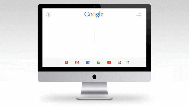
Designed by Mark Manalaysay, this redesign focuses on getting back to basics. And while Google’s homepage might seem like the epitome of minimalism, if you really go back and take a look, there’s quite a bit of noise. Manalaysay explains how he turned down the volume (read his full explanation here):
The first thing to do was remove what I viewed was unnecessary on the home page…
…If I want to future-proof the Google homepage, I feel like voice search is something that has been ramping up and radically improving within the last couple of years. This allows more instantaneous search and deeper integration with Google Now…
…To unify the various services, I went and made a persistent nav bar which will be able to work with all Google services without drastic redesigns. As you can see with my examples for Google+ and Google Maps, you’re able to have a navigation bar which stays the same as you bounce between all the different services…
2. Touch, Swipe, Browse
Arc Worldwide Art Director Alli Grunthaner focused on Google’s mobile experience, and even applied some of that pinch and swipe mentality to the desktop version.
I based my design off of simple tiles that you can personalise to your common searches. I was inspired by today’s technology of “touching/swiping/browsing”… so I thought it’d be a nice interface to use for the different search fields. As soon as your search field is selected, you see a cursor and can begin typing whatever you’re looking for!
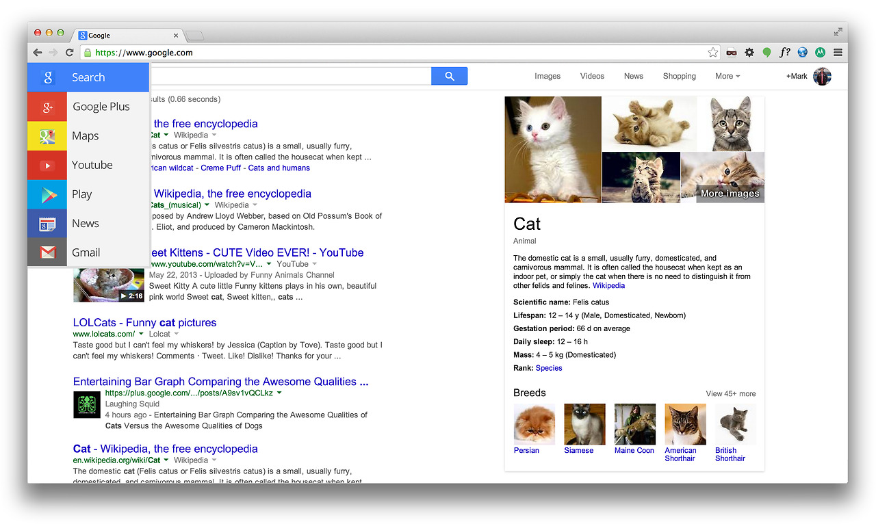
3. In Living Colour
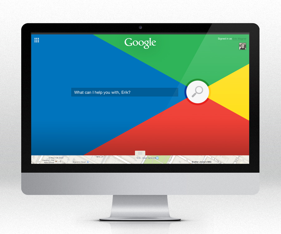
For designer Erik Wagner, it wasn’t so much about changing functionality as it was giving Google’s aesthetics a total overhaul. Wagner describes his vision:
For my execution, I wanted to bring Google’s colour palette forward and create a vibrant, larger-than-life presence for the search function. Depending on what device you’re on, I have the map at the bottom of the browser with a scrubber, allowing the map to expand and take over the browser window.
4. Google Greyscale
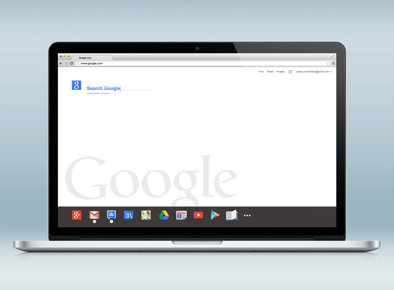
Illustrator and designer Casey Crisenbery pretty much went in the opposite direction, choosing to eliminate bright colours entirely. Crisenbery says: “On the bottom dock, users would find their own apps for Gmail, gChat, Maps, etc. The apps would be customisable and interfaced with the general navigation throughout the partner sites.”
5. Trimming the Fat
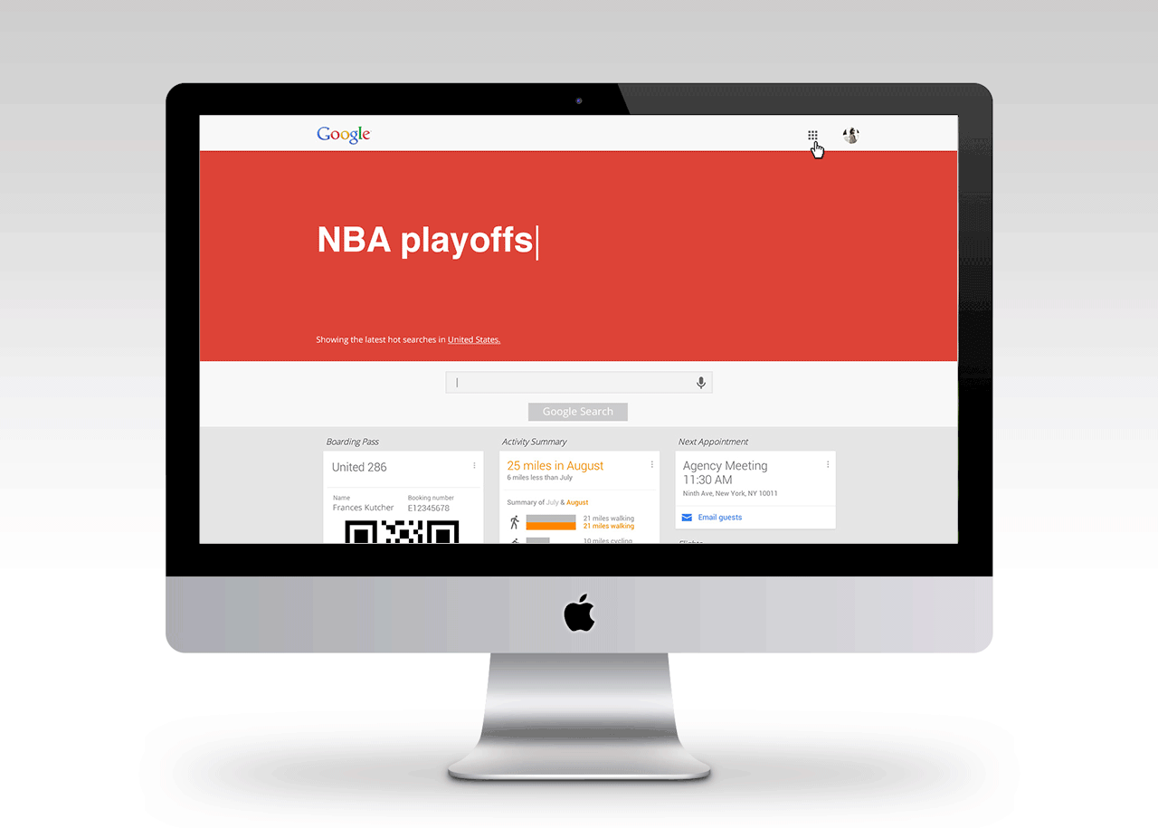
If the previous two options represent the two extremes on the homepage colour spectrum, designer Frances Palmer’s creation sits somewhere right in the middle. Palmer explains her design:
Google has some pretty cool features that not a lot of people know without doing some digging. I thought the use of Google Trends allowed for a bolder look with the solid colour and white bold text. These are searches displayed in real time. You can also toggle between countries and see what they’re searching. I also thought about how the page would look if there was a Google Doodle for the day and I imagine it would swap out with the Google Trends.
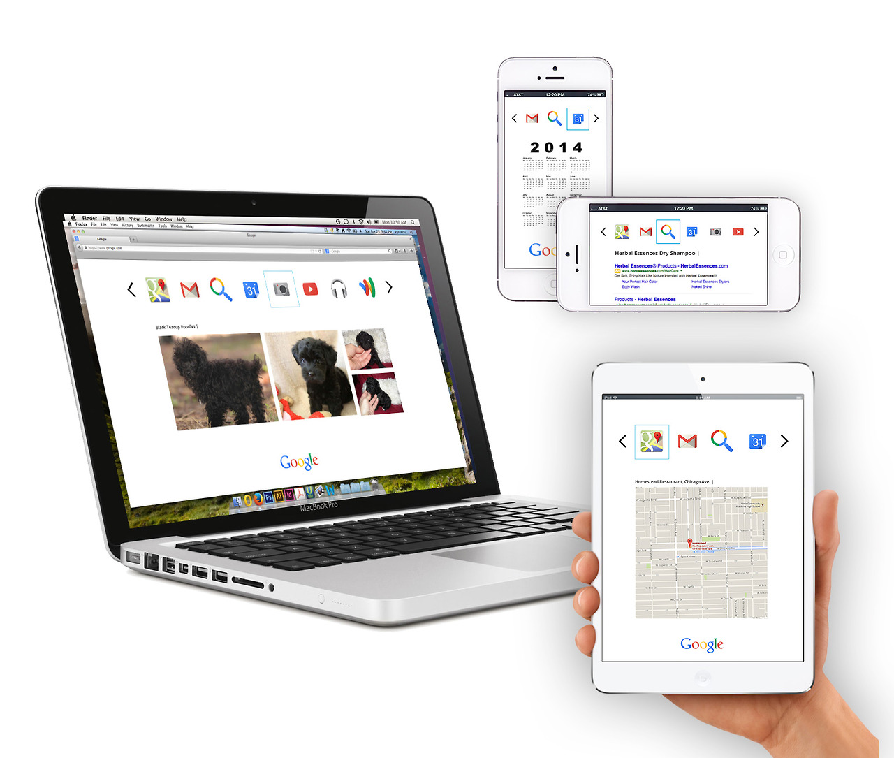
6. A Life Engine
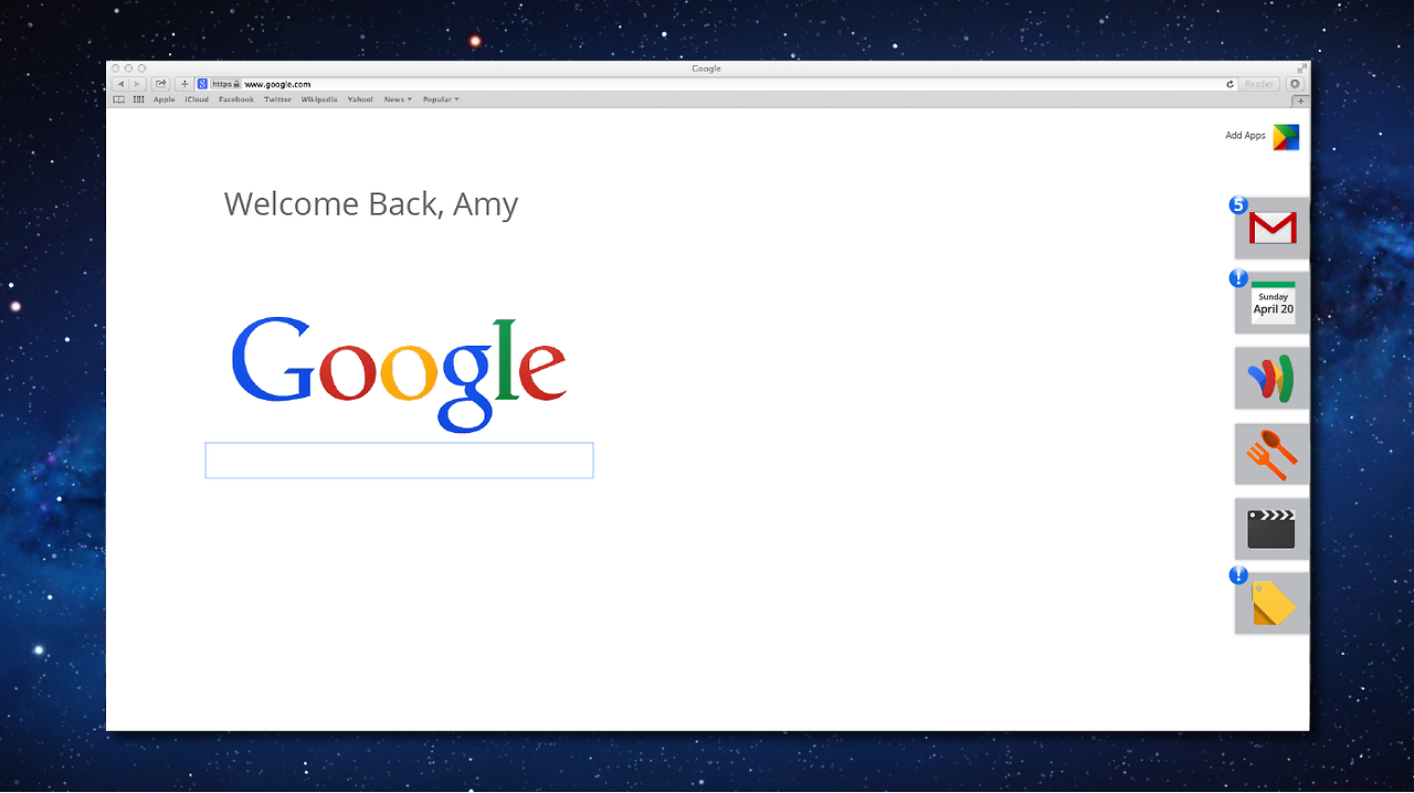
Graphic designer Jenn DiMenna actually did some crowdsourcing to find out what people most wanted from their Google homepage. And what do you know, Android users had the answer:
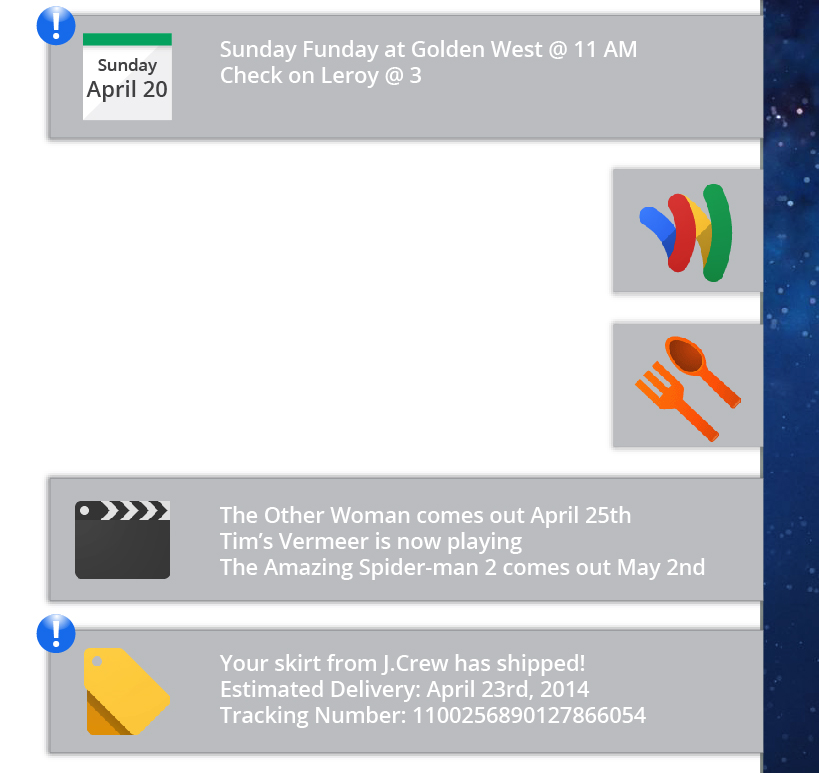
[My friend Amy] told me all these cool things that Google for Android does that I wish could do with one app let alone across all of my devices.
So basically I made Google like a personal dashboard. You have your apps to your right that includes notifications to tell you whether you are missing your TV show, what you have on your schedule and how many emails you have. They are all customisable so you don’t have any required apps and then some free spaces; you can customise everything on your dashboard….
…They are fixed and will always be on the side of the screen as long as you are on a Google page. You can click them to pull them out to reveal all your information. Or you can chose to hide all if need be.
7. Beautifully Bare
Purdue undergrad Jake Nolan’s vision hits on a lot of the same points as the one above, although with less of an Android influence. Instead of changing the way you interact with Google by turning it into a home-base for your life, Nolan’s redesign looks to improve how people already use Google in-browser.
I noticed some unnecessary elements that could go… I also did not like how I had to click to access a list of my commonly used Google Apps/Tools such as Gmail, Calendar, Drive, YouTube and Maps. This resulted in me pulling them into the bottom with the idea that, once signed in, those preferred apps could be switched around to include other products the likes of Google Wallet or even an RSS link for a Blogger page.
…I propose that the voice search command is, by default, always active when Google.com is visible. With voice recognition and increased interaction with our technology I think this could really help immerse the masses in voice commands and human/technology experiences.
So, what do you think? Are any of these better or worse than what Google gives us now? Have these designers missed a major flaw? [Letters Society, Project 9 via The Techblock]