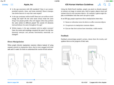
Apple’s iOS Human Interface Guidelines, a set of tips and rules for designers that was previously only available through the developer portal, is free on iBooks as of today. It’s a little glimpse into how Apple hopes app developers will follow its lead when it comes to design.
The “book”, which is more of a primer, covers everything from aesthetic decisions to actual user experience decisions. For example, in the Color and Typography chapter, we learn about kerning and font size. Meanwhile, we also get insight into the nitty gritty of UX — from consistency to figuring out who your users even are.
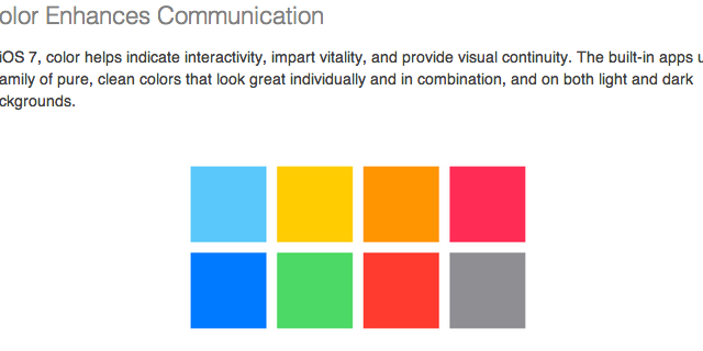
It sounds like a document for developers, but it’s actually a fascinating insight into how Apple thinks about design. That ranges from building palettes of “pure, clean colours” to breeding trust in your users: “Important: Don’t tell people to reboot or restart after installing your app. Restarting takes time and can make your app seem unreliable and hard to use.”
It’s remarkably fine-grained. Maybe the heydays of great corporate graphic standards aren’t over yet, after all. Download it here. [David Addey; Slashgear]