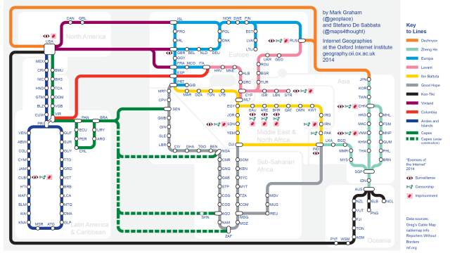
Everything is easier to understand when it’s drawn up as a well-formatted train map — including the internet. This one, for instance, shows a simplification of the world’s network of submarine fibre-optic cables.
Created by researchers from the Oxford Internet Institute, the map uses data from cablemap.info. Each node represents a country, and the links between them the fibre optic cables that allow data to flow between. The guys who made it explain:
The centrality of the nodes within the network has been calculated using the PageRank algorithm. The rank is important as it highlights those geographical places where the network is most influenced by power (e.g., potential data surveillance) and weakness (e.g., potential service disruption).
Some short links — such as the intricate networks under the Gulf of Mexico, the North Sea and the Mediterranean Sea — have been left out to avoid the image becoming too cluttered. There’s extra information on there too: Symbols point out Enemies of the Internet — based on the 2014 report by Reporters Without Borders — detailing those who surveil and censor online.
You can go check out their full rundown on the map here. [Oxford Internet Institute]