Maps are great. Maps help us get where we need to go and can sometimes teach us things about the world we live in. But unfortunately, the internet has been infected by a scourge of stupid maps. And stupid maps are making us dumber.
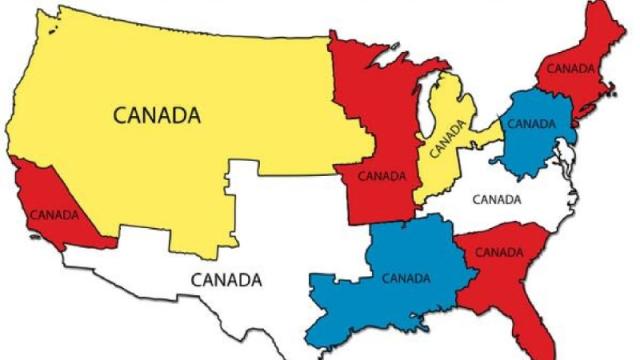
Let’s look at the map above. Maybe this map wanted to tell us something about Canada. Perhaps it’s something like the fact that Canada has a much smaller population than the US. But this map tells us NOTHING about Canada’s population. There are no numbers, no data points, not even a corresponding map of Canada itself. And there’s no sense of comparison. No one can look at this map and say, wow, it totally makes sense that Canada’s population is the same as this other large, unspecified portion of the US, which wildly fluctuates in population density. (And not to nitpick or anything — too late — but this map completely ignores Alaska and Hawaii.)
Maybe that map doesn’t work for you at all. Perhaps you’d like something a bit more topical?
Now, come on. First of all, this map doesn’t show anything like “population distribution.” Second of all: “units of Ukraines”? This one at least comes with some explanation, over at Maps on the Web:
Ukraine population: 45,426,200 USA population: 317,632,000
45,426,200 x 7 = 317,983,400
So, it’s pretty close.
Wait, what’s pretty close? Maths? I don’t need a map to tell me the population of the US is about seven times larger than the population of Ukraine. I just did that in words.
Clearly, there are many things which are best expressed in map form, but not comparing the population figures of two countries. That’s why this map with landmasses adjusted for total population is kind of brilliant in its own way — it actually shows us why trying to measure anything using the size and shapes of states is a bad idea:
If you wanted to make some kind of map-like comparison between Ukraine and the US, might I suggest something like this, where the geographic size of one country can be compared to the other:
Here’s another good map about Ukraine, where you’re able to see a complicated political story told through geography. Here, using a map actually makes some sense:
But some ideas are better written than visualised. And then there are those ideas that maybe should not even be written or visualised. There’s one particular type of map that keeps resurfacing, which is really not a map — it’s a way to make ridiculous generalisations about culture, masquerading as a map.
This map shows which country your state has the most “in common” with. So, like, Arizona has the most in common with Iraq, of course: “Whether you’re in Arizona or Iraq, you’ll witness the shared problems of sandstorms, a porous/lawless border, high murder rate, and serious heat. However, the sunsets are incredible.” Sure?
See also:
If anything these maps perpetuates stereotypes and xenophobia (not to mention that being the worst at “most sickly” means you’re pretty healthy?). With their dubiously sourced statistics, they simply reinforce what we think we know about places, instead of introducing us to new information. They’re misleading at best, and dangerous at worst.
We’re as guilty of it as anyone. We posted this map and included it in our list of 2013’s best . It at least sources its information, but it definitely veers on the edge of stupid.
A map is graphic shorthand and can deliver many complex messages at once. But what starts to happen is that maps can all too easily devolve into a punchline.
The problem is that it’s getting harder and harder to tell the stupid maps from the joke maps. Take this map, for example, which is touted as “amazing” by Bostonography (who make a lot of good maps, by the way):
I’m pretty sure it’s a joke… pretty sure. I hope.