Cameron Booth is a seasoned graphic designer. In his spare time, he also edits transitmaps.tumblr.com, the web’s finest emporium for bus maps, subway diagrams, train network maps and more. We’re enormous fans of his site and wanted to pin him down on a subject that’s close to our own hearts: what makes a good transit map?
HERE Three Sixty: Cameron, tell us. What’s your favourite transit map? And what makes it so good?
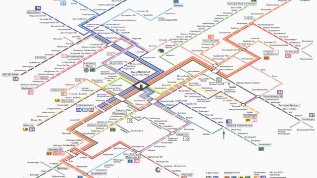
Cameron Booth: One of my all time favourite transit maps is this one that was used in Stuttgart, Germany c. 2000. Unusually, it chooses to represent the city’s network on an isometric grid (using 30-degree angles almost exclusively), rather than the more usual orthogonal method, which uses any multiple of 45 degrees.
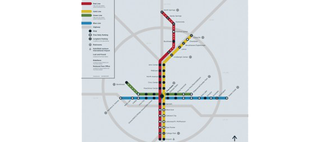
An example of an orthogonal map
The effect is striking, accentuated by the three-dimensional treatment given to the Hauptbahnhof and its distinctive tower in the middle of the map. For me, this diagram ticks all the boxes:
- It’s clear and easy to understand. Routes are easily traceable from one end to the other, interchanges and termini are clearly denoted, icons for points of interest are simple and unmistakeable, and the legend is simple and concise.
- All of the labels on the diagram are set horizontally, which aids quick reading and comprehension, as well as looking neater than angled labels. The unusual isometric viewpoint helps a lot here, as it allows station names to nest next to the route line nicely, without ever being in danger of clashing with it.
- It has a look that is uniquely its own, rather than being yet another Tube Map clone. I absolutely love transit maps that have a sense of place about them: a map that could only ever belong to one city, and this is one of them.
- To top it all off, it’s also absolutely beautiful to look out. While conveying information is a transit map’s most important function, aesthetics play a huge part as well. I h4ly believe that transit maps play a hugely important part in the public’s initial perception of a transit system: if the map is easy to use and beautiful to look at, then it will encourage people to use the system. Conversely, if the map is poorly designed and difficult to comprehend, then that’s going to have a negative effect on users.
Transit maps need to be instantly comprehensible. What does that force on the design?
CB: A strong informational hierarchy is an absolute necessity. By that, I mean that the most important elements of the map should be immediately and intuitively obvious.
Transfer/interchange stations need to be clearly shown — working out where to interchange with other services is always one of the biggest challenges faced by transit users.
Route termini should be clearly marked, especially if trains or buses refer to those endpoints on their signboards (e.g., Piccadilly Line to Cockfosters). Here, the Paris Metro map does a better job than the London Tube map, for example, as it makes the station name bolder and shows the route numbers that terminate there.
If there’s more than mode of transportation shown, then the pre-eminent one needs to stand out the most to make it easiest to find. A good example of this is would be a subway map that also shows connecting commuter rail, bus and ferry connections: the subway needs to be shown as the most important part of the map, and each other service should be indicated in descending order of importance with progressively thinner route lines/smaller labels, and so on.
We’re all about the digital at HERE, but of course, transit maps need to also be physical objects like maps, stop signs and more. Is digital mapping enabling or complicating the ability for cities to get people around? In what ways?
CB: Well, almost everyone has access to a map in one form or another right in their pocket these days. Be it a smartphone or tablet, information is right at our fingertips wherever we go. It’s not always accurate though, and I think sometimes people put a little too much trust in their device, rather than trying to work things out for themselves. A small screen isn’t always the best way to understand how transit in a city pieces together: a decent paper map is a lot easier (for me, at least) to pore over and really understand how things work.
Innovations like the new touchscreen subway map kiosks in New York City are a hint of things to come: the future holds maps that update dynamically based on the time of day, that keep you updated about track maintenance that might affect your trip, or provide detailed information about transfers. Digital mapping and live data feeds promise a much more dynamic, fluid look at transit than a static paper map can ever provide — but I don’t think we’re quite there yet.
As a designer who spends a lot of time looking at transit maps, what is the one thing you see all the time that you’d like to ban forever from transit maps?
CB: Only one? I mentioned angled labels above (especially randomly angled labels!), but my other pet peeve are diagrammatic maps that insist on placing their simplified, rectilinear route lines over a “geographical” background, with coastline and rivers shown in absolute, curvy, natural detail. Examples of this are Sydney’s old map, and Boston’s “T” map. Not only is the “geography” almost always horribly distorted to wrap around the schematic route lines, but the clash of styles between straight and “natural” is almost always a bad thing. It’s definitely better to simplify the background in a style that’s complementary to the route lines for a more unified look. Please!
You probably prefer schematic transit maps, but what do you think of transit maps that are more geographically accurate, like the NYC Subway map?
CB: Geographically accurate transit maps definitely have their place. They’re generally more suited to depicting bus systems than schematic diagrams are, simply because they can give the transit user a better spatial awareness of how the bus connects with their neighbourhood — how far they might have to walk after getting off the bus, which exact roads the bus travels along, even a rough idea of how long the trip might take.
The New York subway map, though, is probably guilty of trying to do too much at once: it’s a subway map, tourist map and locality guide all in one… and ends up not doing such a great job of any of them. I find it very busy and cluttered, although recent editions have cleaned it up and simplified things somewhat. For me, New York’s complex system is best represented by a hybrid map/diagram like Eddie Jabbour’s KickMap: it simplifies the system like a diagram, but retains enough geographical information for users to orient themselves to the city around them.
Pictures: Cormac Phelan, Stuttgart City Information Site, CityRail, Riga Transit,Andrew Whited
This interview by Ian Delaney originally appeared in HERE Three Sixty, the official blog of HERE, Nokia’s location business. It has been republished here with permission.