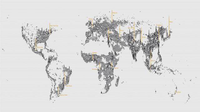
We’ve seen a lot of world population maps, but this might just be prettiest one yet. Simple black lines trace the population density by latitude, so that a few cities, labelled in yellow, tower like the skyscrapers over the land. It’s not unlike a cartographical version of Joy Division’s Unknown Pleasures album cover.
Go ahead, embiggen the full map. It’s worth it.
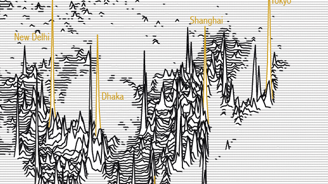
James Cheshire, a geographer at University College London, created this map last September. As Cheshire notes on his blog, Asia immediately stands out as a series of dense, jagged peaks.
But what’s even more interesting is the negative space. Australia disappears into few coastal blips. Siberia is barely there. And the Sahara desert is a blank expense. These abstract lines representing people are also an indirect indicator of earth’s geography, demonstrating how the spread of our built world has been shaped by the natural one.
The Population Lines print is for sale at Cheshire’s site, spatial.ly.
Pictures: James Cheshire