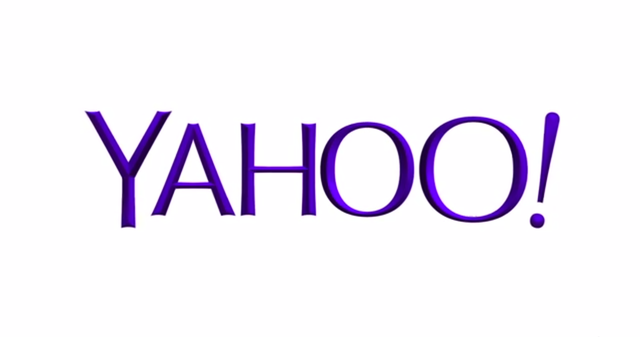
Yahoo finally unveiled its new logo after 30 days of zany decoy versions. It’s a staid little number, the main surprises of which are its intense new shade of purple, an ever-so-slight serif, and an odd architectural shadow effect. It’s a more traditional, adult design — and it hints at how Yahoo is changing on a larger scale.
The logo, a three-dimensional variant of a 70-year-old typeface called Optima, will be a disappointment for those who hoped for a larger overhaul of Yahoo’s brand. But a dramatic change would’ve likely stirred up more controversy than it was worth. Historically, the internet has not been kind to big, public logo changes (see: Tropicana and Gap). Yahoo chief Marissa Mayer — fighting valiantly to raise profitability as ad sales continue to lag — is smart to focus on Yahoo’s products and user experience first.

Yahoo’s original logo.
When Mayer was at Google, she played a part in developing a kind of UX that put visual and conceptual clarity over branding. The Google home page — in which she was a crucial player — is a great example of this: a logo, a bar, and two buttons. Those elements haven’t changed in 15 years (to the day!), though the way we use the Google homepage has changed wildly since then. And in a way, the new Yahoo logo tries to replicate Google’s successes; Both logos share a traditional typeface, shadows, and textured edges.
The new logo was designed by an in-house team at Yahoo, and it’s based on a typeface designed by Hermann Zapf in the mid-1950s called Optima. The design team chose to add quite a bit of depth to the mark, both through shadows and through an extruded line that runs down the middle of each character. The result is jarringly three-dimensional, and paired with a blinding new hue of purple, was clearly designed to stand out on mobile screens.
While the logo itself leaves much to be desired from a type design standpoint, it definitely illustrates how logos themselves are less and less important these days (or as Forbes‘ Jonathan Salem Baskin put it, “why logos don’t matter”). In the pre-internet age, a brand’s logo was a critically important tool, a piece of infrastructure that played a concrete functional role: Where’s the next McDonalds? Is that soda a Coke? That’s not really the case on the internet: The logo is simply part of the fabric of an information-dense page, the content of which is ever-changing. Only the semantic information — a company’s name — matters when you “choose” it, by typing it into the URL bar.
So a new logo, for Yahoo, is more a way to signal the changing of the guard than a solution to the company’s larger problems. If we really want some insight into how Yahoo is changing, we’d be better off focusing on how the site actually functions.
Besides: Yahoo is known for tinkering with its logo without notice, often based on user testing. So if our luck holds, that strange 3D effect will quietly disappear over the next few months.
