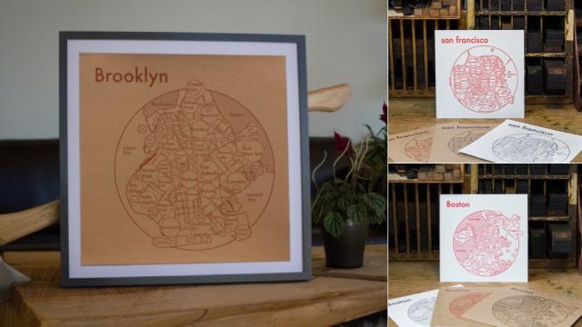
In New York City, you can cross the street and then — bam! — you’re in a completely different neighbourhood. But those exact boundaries are hard to pinpoint, and they’re always changing. These minimalist maps by Archie’s Press condenses them into simple circular designs that convey the way neighbourhoods overlap.
So, why circles? “I use circles because they are the most graphically simple shapes for our eye to understand,” explains Archie. “When we are faced with a barrage of circles, our brains don’t get the ‘dazzle effect’ that kills our ability to understand a big information system. Instead, we get a holistic vision of the city’s layout and essential landmarks that sticks to our brains.”
Right now, there are maps for Portland, San Francisco, Brooklyn, Manhattan, Boston, Seattle and Amsterdam. Each print is 17.5 inches by 17.5 inches and costs $US29. They’re not your conventional city maps, but they do make you think about how city systems work. [Archie’s Press h/t @DesignSponge]