In its first major redesign since 2000, The New Yorker has revitalised its brand: gently updating its layout, redrawing its 88-year-old typeface, and recruiting a contemporary typeface to solve today’s design problems. But don’t worry — Eustace Tilly is not about to go all Gap logo on you.
For many readers the changes will be nearly imperceptible — as editor David Remnick tells the New York Times, if the magazine “fell on the floor and were three feet away, it would still be identifiable to longtime readers.” But design types (and my, they do like to make a big fuss about this kind of stuff, don’t they?) will notice the updates right away. Creative director Wyatt Mitchell talks more about the process in this video.
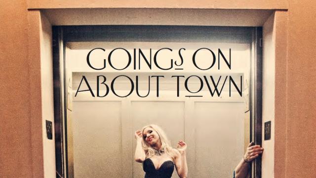
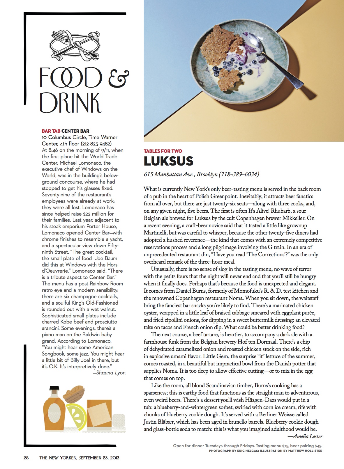
The biggest changes are found in the “Goings On About Town” department, with new type treatments, spot illustrations and layouts that better accommodate photography (which was only first introduced to the magazine in 1992). The new visual vocabulary will gradually be expanded to other sections and be integrated across all platforms, Mitchell tells Gizmodo. “Ultimately we are looking to revitalise the printed magazine and its visual tradition, bring new life to its digital family members, and sharpen the brand that unites them — while carefully cultivating its continued legacy.”
It was honouring that legacy that was key to the redesign, says Mitchell. “Without proper respect for the unique history and weight of this beloved magazine, and a strong emotional understanding of its pages’ aesthetic, a redesign could do irreparable damage to a cherished experience for a large and loyal audience,” he notes.
Indeed, they don’t seem to tinker with it much. Designer Massimo Vignelli (who designed the original New York City subway map and the former American Airlines logo) was responsible for the last redesign 13 years ago, introducing similarly light touches like a more structured grid to the layout and the addition of red type to the front-of-book sections.
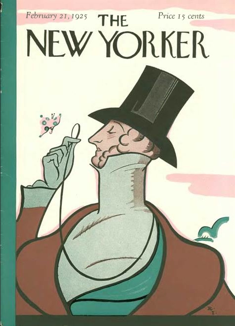
Perhaps most notable for the current refresh (maybe mostly to design nerds) is a revitalisation of The New Yorker’s custom typeface. Rea Irvin, the magazine’s founding art director, was typographically inspired by the illustrations in a 1915 book named Journeys to Bagdad and reached out to its artist, etcher Allen Lewis, to create an entire alphabet of the woodcut type. Lewis turned down the job so Irvin designed the typeface himself, which became known simply as Irvin.
Refreshing Irvin for the redesign required redrawing some of the letterforms, a typical task when modernising historical typefaces. The in-house team redrew the typeface in partnership with typographer Ben Kiel of type foundry House Industries. (The typeface is not available for commercial use, although many brands try their best to copy it.)
For 88 years Irvin served as the display type for the magazine, with Caslon (an 18th century typeface reimagined for the digital age by Carol Twombly as Adobe Caslon) as the body text. But today the graphic needs of the magazine are different, says Mitchell. “As we build complex content hierarchies across multiple platforms, the New Yorker’s primary historic typefaces — Irvin and Caslon — prove to be tools too limited for the problems we need to solve regularly,” he says. “So we’ve added another tool to produce the typographic tension we need to communicate more clearly, more consistently.” Ladies and gentlemen, meet Neutraface.
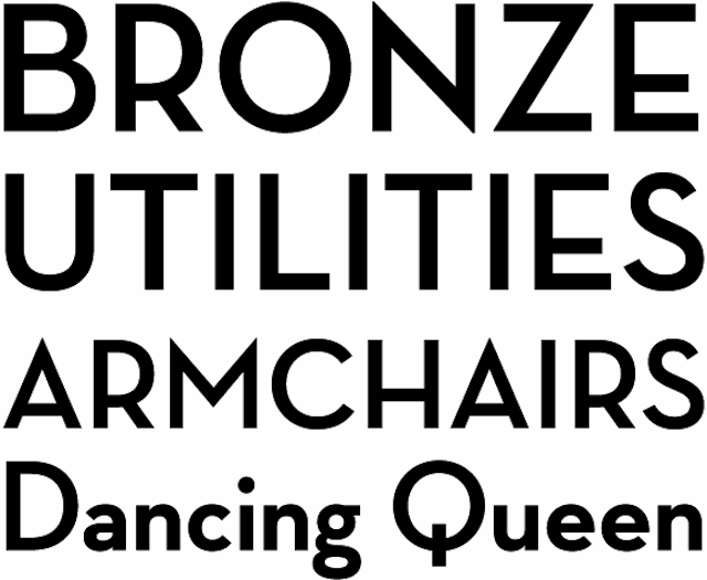
Neutraface is now being used for the magazine’s headlines, but you might have seen a version of it on your neighbour’s house. The letters are based on signage designed by modernist architect Richard Neutra for many of his buildings around Southern California — not very “New Yorker.” But Mitchell says it’s more about the time period Neutraface evokes than the place. “Because the brand is still so strongly rooted in the Art Deco tradition, Neutraface — a modern spin on a deco theme — offers us a new type-style that doesn’t feel misplaced or far-removed from our graphic tradition,” he says.
Type designer Christian Schwartz, who created the typeface for House Industries in 2002, calls Neutraface a work of “historical fiction.” By surveying the buildings that Neutra designed, he was able to extrapolate a mythical typeface. “I took the limited number of uppercase letters and numbers we were able to find in photographs of Neutra’s buildings, filled in the missing letters, and then looked at geometric sans serifs from the early 20th century to help me start to imagine how this would have looked if it had been a typeface rather than just architectural lettering.”
But even the best typographic intentions can’t dictate what happens with a typeface is released into the wild. “The New Yorker is one of the more appropriate places I’ve seen it used,” says Schwartz. “There was an Italian movie called I Am Love that used it in the titles, combined with beautiful calligraphy — that was one of my favourite uses.” He, too, sees it on many residential projects, often selling luxury condo developments in New York. And then there are the uses that Schwartz finds completely baffling: “Scotch Pet Hair Removal Tape. Advertising for Wendy’s and the Olive Garden. Toothpaste. Lena Dunham’s Girls.”
As a testament to its cultural relevance, there’s also a Lady Gaga-inspired video tribute to “Neutra Face“, although sadly the creator of the video butchers the name (it’s “noy-tra” not “new-tra”). Perhaps that is the price that type pays for ubiquity. Says Schwartz, wistfully: “I wish he had pronounced the name of the typeface right.”
Pictures: The New Yorker, House Industries