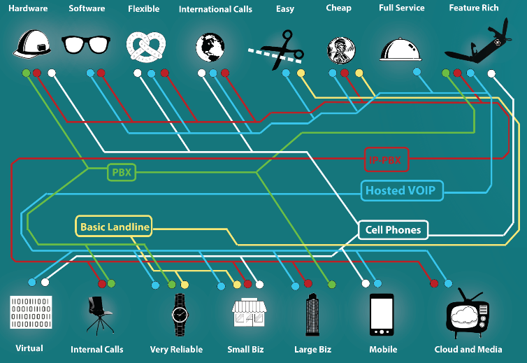
8 Horrible Data Visualisations That Make No Sense

8 Horrible Data Visualisations That Make No Sense

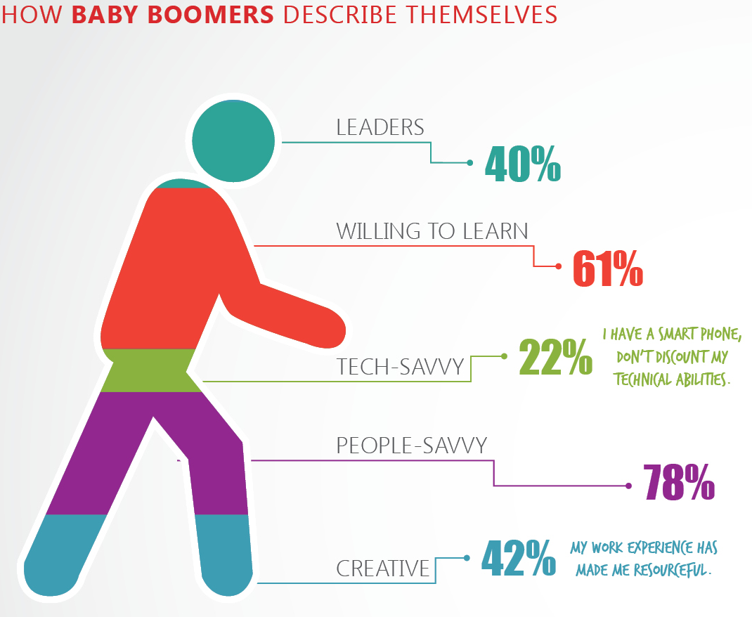
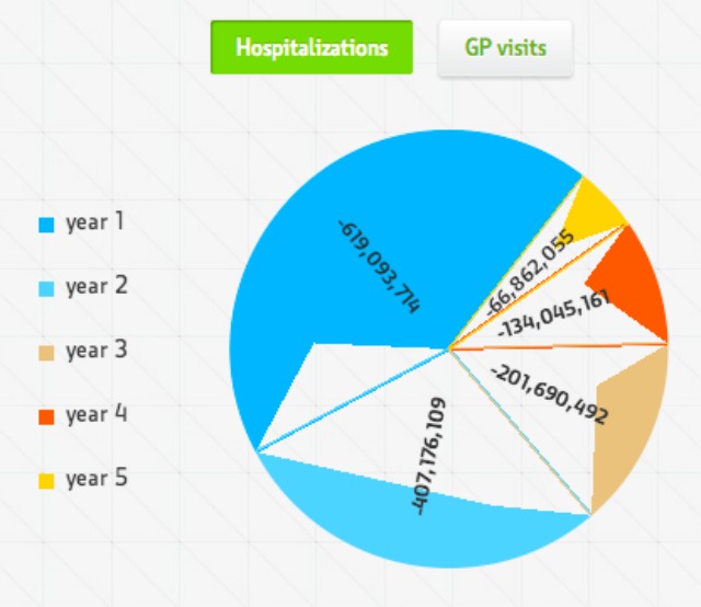
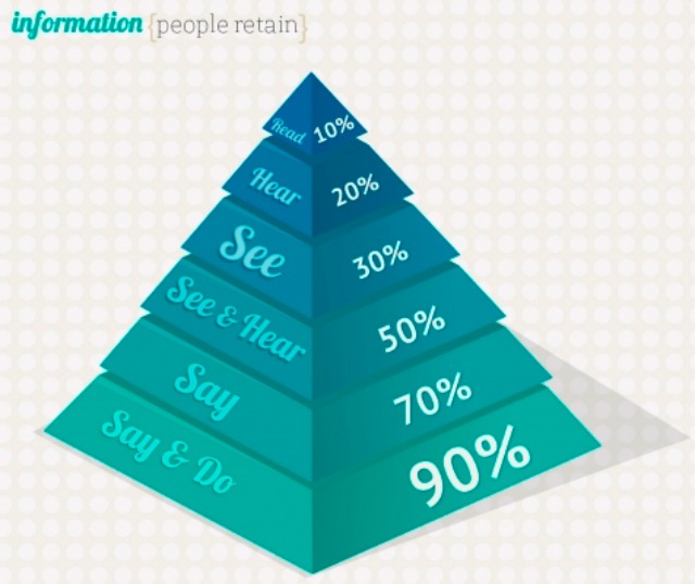
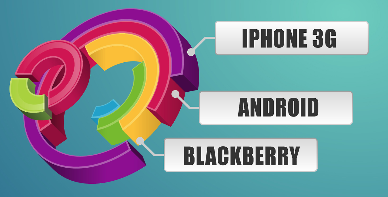
Data visualisation can be a great way to drive numbers home and give them a visual weight mere statistics don’t have. At least that’s what happens when they make sense. Sometimes, visualisations are downright dumb and just make things worse. Like these.

WTF Visualizations has been curating a lovely collection of infographic excerpts that represent the absolute nadir of the form. And while things like this might be pretty horrifying to find in the wild, we can have a good laugh about them here. A good, horrified laugh. Here are a few of our favourites.
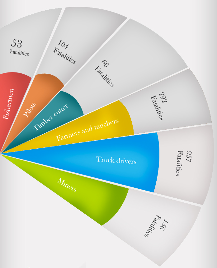
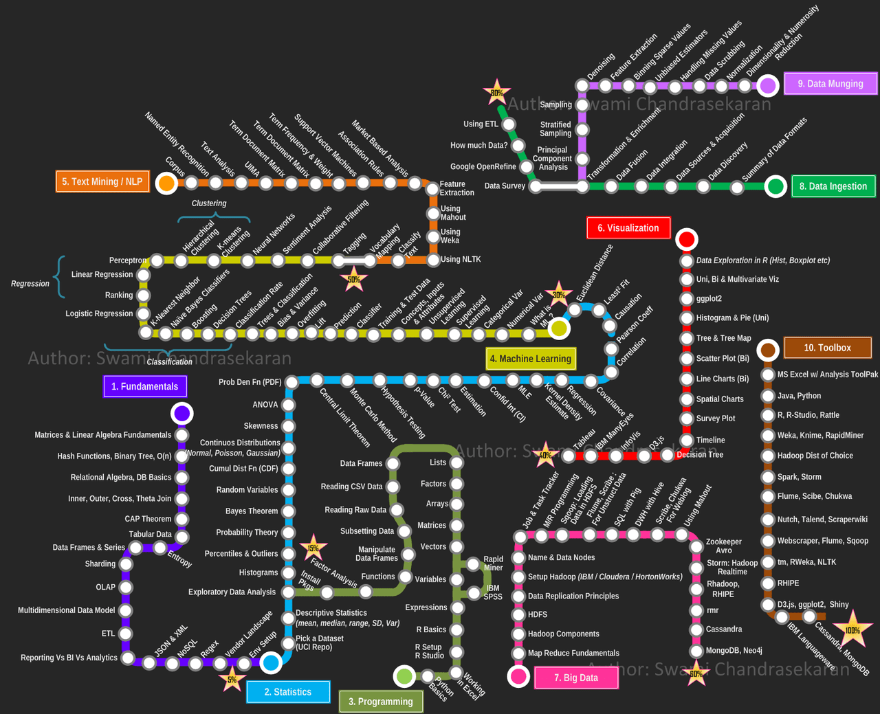
8 Horrible Data Visualisations That Make No Sense

8 Horrible Data Visualisations That Make No Sense

8 Horrible Data Visualisations That Make No Sense

8 Horrible Data Visualisations That Make No Sense

8 Horrible Data Visualisations That Make No Sense

8 Horrible Data Visualisations That Make No Sense

8 Horrible Data Visualisations That Make No Sense

You can check out even more (from the past and in the future) over at WTF Visualizations. [WTF Visualizations via Hacker News]

The Cheapest NBN 50 Plans

It’s the most popular NBN speed in Australia for a reason. Here are the cheapest plans available.

At Gizmodo, we independently select and write about stuff we love and think you'll like too. We have affiliate and advertising partnerships, which means we may collect a share of sales or other compensation from the links on this page. BTW – prices are accurate and items in stock at the time of posting.