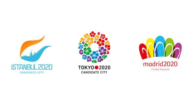
The 2020 Olympics will be held in either Istanbul, London or Tokyo, but no matter where they’re held, the logo will be boring. There’s a 66 per cent chance the logo is going to be some stupid flower.
How did this happen? Indecision and fear. Brand New describes the arduous bidding process, which results in countries simultaneously trying to jam the logo designs full of conceptual content while making every effort bit to offend anybody’s sensibilities. You might remember that the London games in 2012 were mocked and criticised because the logo looked like one figure performing fellatio on another. And let’s not forget the embarrassment Vancouver felt in 2010 when it turned out one of its Olympic mascots kinda sorta looked disturbingly at home next to a creepy Pedobear.
So the resulting logos are simultaneously confused and bland. Take, for example, the Istanbul bid’s design. It’s a tulip, a traditional symbol for the city, combined with a skyline in a logo that looks like a bad Georgia O’Keeffe knockoff. In fact, all of these logos kind of have Georgia O’Keeffe vibe to them, huh? Wait, but isn’t her work also a little… suggestive? Oops. A look back at the logos of yore would seem to indicate that we can do better.
When the International Olympic organising Committee picks the 2012 host city on September 7th, we’re going to get stuck with one of these. So which logo do you like best? [Brand New via BI]