
The world has changed in countless ways since Buckminster Fuller invented the Dymaxion map in 1943. Wars have come and gone, populations have changed, and entire generations have passed. But Bucky’s map endures, thanks to its endless adaptability — and to prove it the Buckminster Fuller Institute recently invited the public to help reinvent the map for 2013. Today, we get a glimpse at the best entries.
Why was the Dymaxion map so revolutionary in the first place? Because cartographers spent centuries working towards a single, universal world map, striving to set up a standard that every country would go by. Fuller, on the other hand, did something radical: He imagined a map that could be rejiggered depending on what the user might want to visualise. For example, you can rearrange the pieces to show political affiliations. Or the flow of air over the Earth. Or nearly any other piece of geospatial information. It was an entirely new way to see how nations and landmasses are related.
And it’s still relevant, if the eleven finalists in the Dymax Redux contest are any evidence. The competition was launched on the 70th anniversary of the original map in April, and this week, the judges announced the finalists. From a Dymaxion map of the moon to a map that charts the entire ancestral path of one illustrator, check out the highlights below.
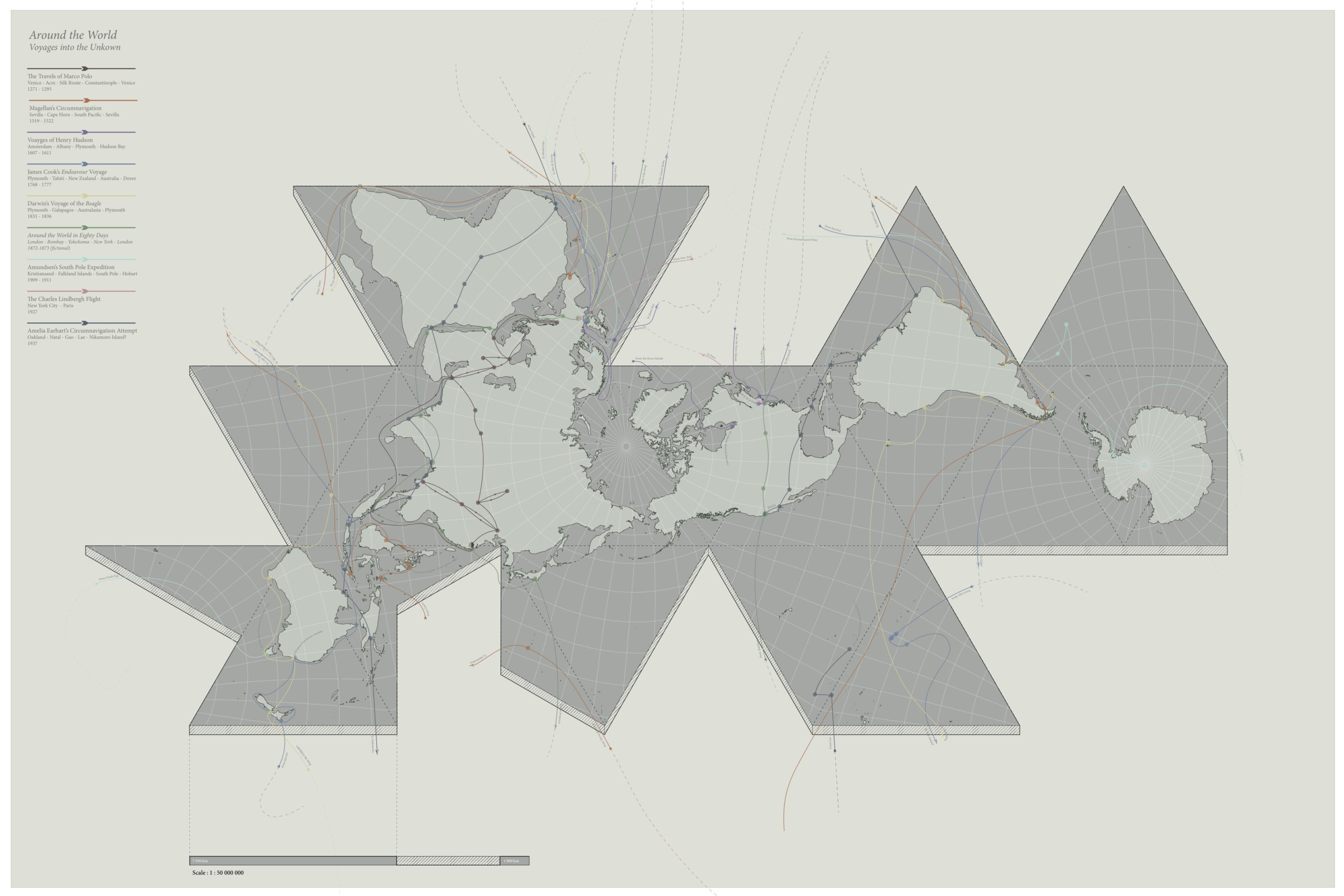
Around the World; Voyages into the Unknown, by Patrick Ryan Bourgeois and Akshay Mehra, arranged the pieces of the map according to famed exploration crossings, from Marco Polo to Amelia Earhart.
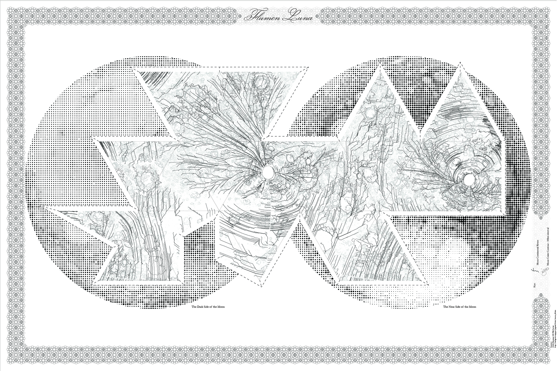
Flumen Luna by Hector Tarrido-Picart, applies Fuller’s tessellated map to an entirely different planet: The moon.
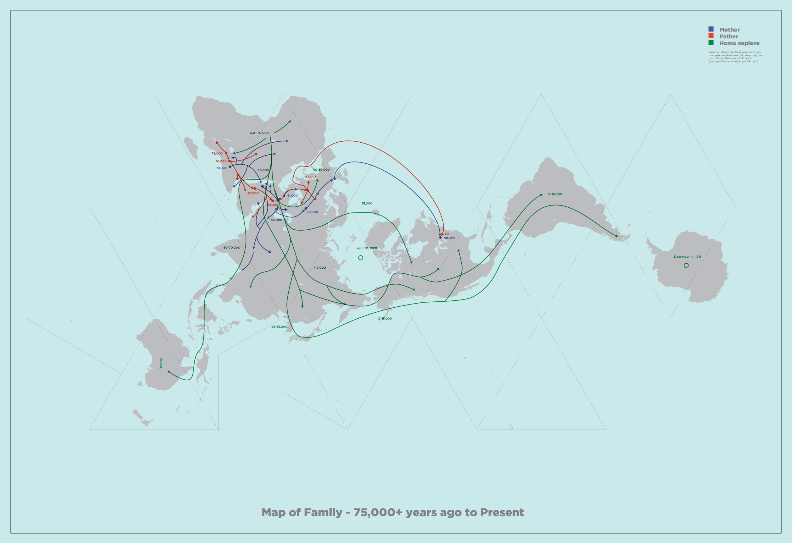
Architecture student Geoff Christou took things personally, creating a map based on ancestral migration that reaches back 75,000 years.
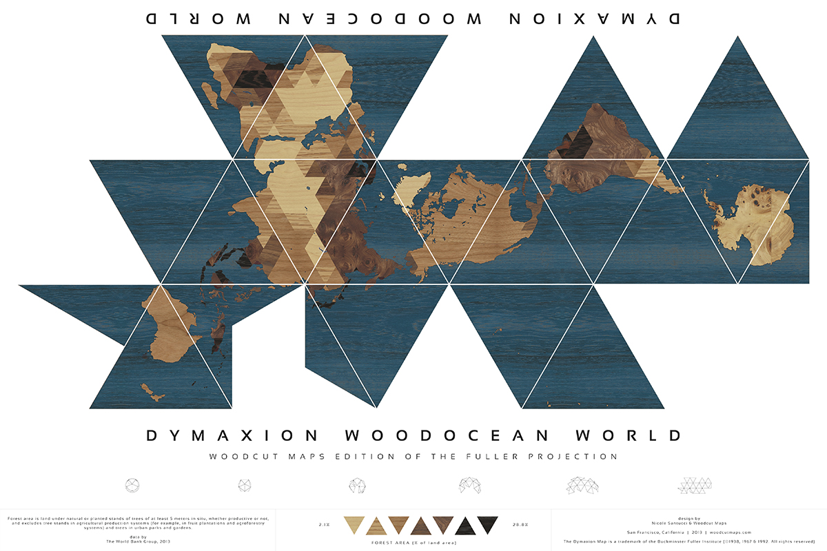
Dymaxion Woodocean World, by Nicole Santucci and Woodcut Maps, illustrates the density of forests across the world. Darker wood means a higher ratio of trees to land.
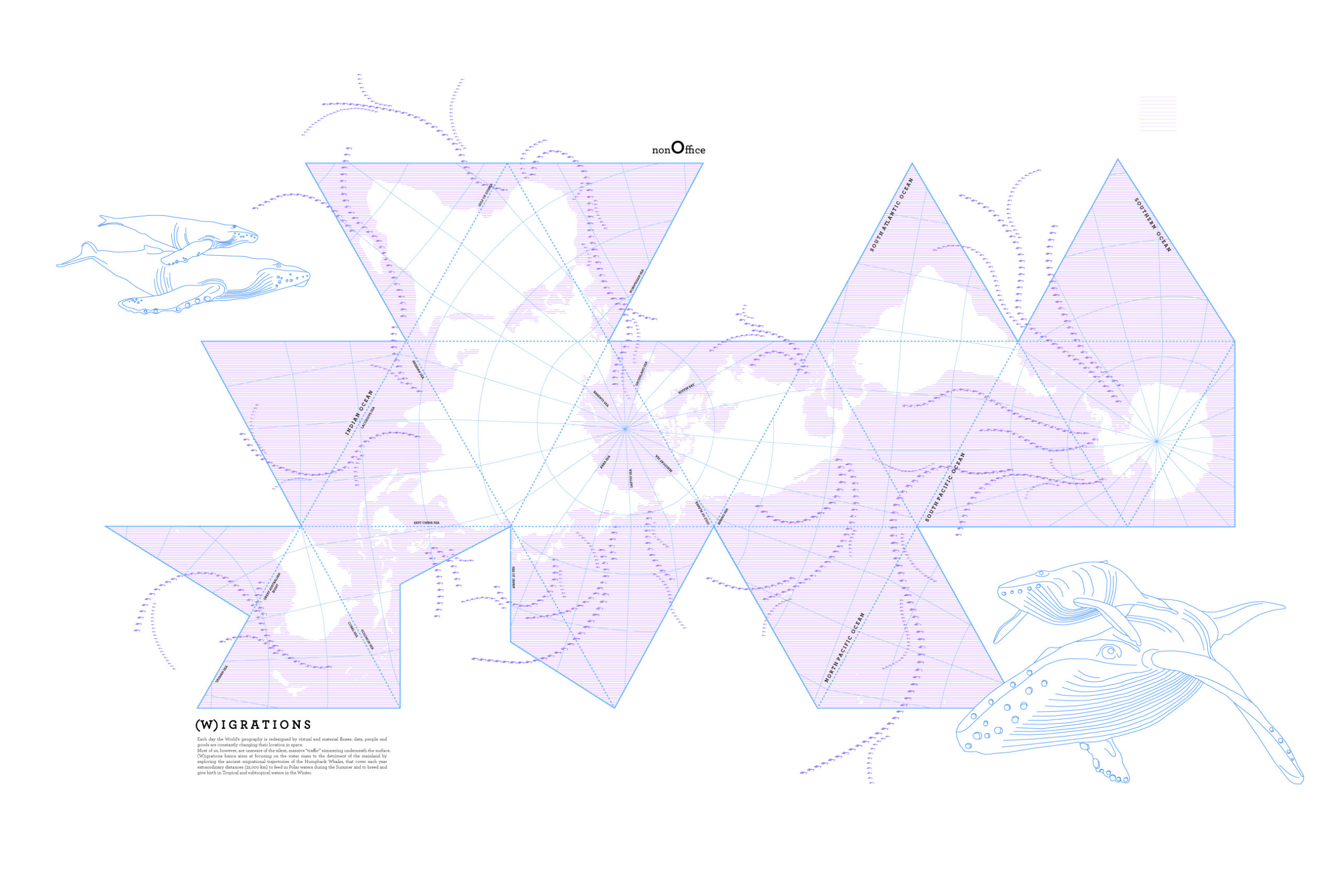
Jonathan Robert Maj mapped the travels of humpback whales — which travel extraordinary distances on a yearly basis — to create this iteration of the map. “Most of us are unaware of the silent, massive ‘traffic’ simmering underneath the surface,” he explains.
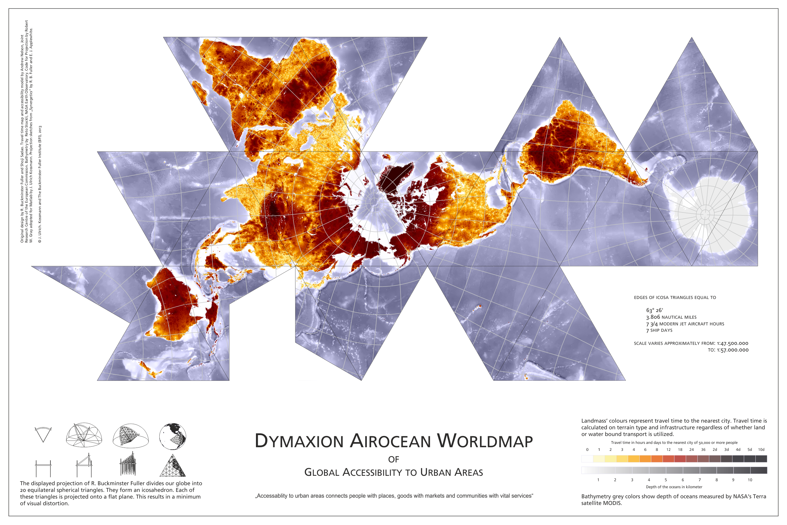
German designer Jan Ulrich Kossmann maps the amount of time it takes to get to the nearest urban area in this illustration, creating what is essentially a map of the most isolated places on earth.
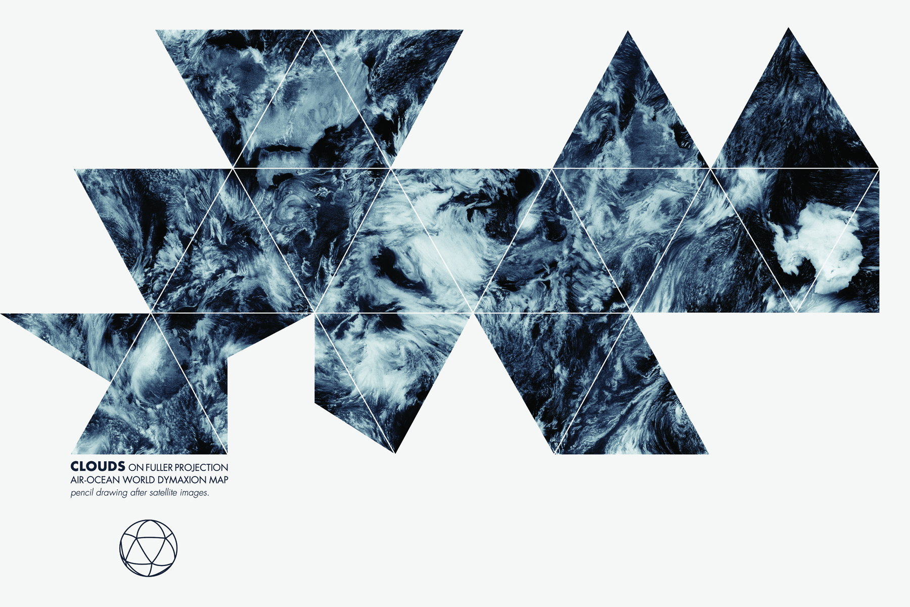
French illustrator Anne-Gaelle Amiot created one of the most beautiful versions of the map, which is hand-drawn based on satellite images of the clouds over Earth.