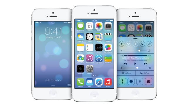
Today, after plenty of self-deprecating jokes about virtual cows, Apple unveiled a sweeping overhaul of the mobile software by Jony Ive. After months of speculation and weeks of rumour-mongering, we finally have our answer: the future of iOS is actually rife with dimensionality and texture, which is a good thing.
The predicted rebirth Susan Kare’s original black-and-white OS design, it ain’t. Actually, let’s just ban using the term “flat” altogether for this post. This iOS 7 we met today was full of what Jony Ive called “new types of depth”. Alongside a poppy, neon-and-pastel colour scheme, the icons, apps and homescreen of iOS 7 are full of layering and dimensionality. There are also entirely new types of animation: from a screen that uses the accelerometer to adjust in parallax to beautiful new animated weather icons.
Sure, Jony Ive has gotten rid of many of the richly detailed skeuomorphic elements that were originally designed to help first-time users get to know iOS. But he’s also introduced all sorts of interesting new complexities. For anyone expecting a Windows 8 look alike — you can rest easy. Let’s take a closer look.
An Ambient, Environment-Sensitive UI
The big focus on today’s unveiling was the apparent simplicity of the apps and icons. But for all the simplicity, the most telling element of the new UI is its complex adaptability to external environmental conditions.
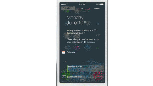
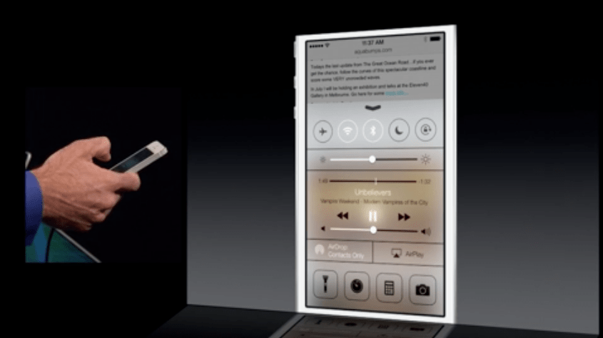
The biggest — and perhaps most elegant — element of the new system is its responsivity. For example, iOS 7 uses the accelerometer to adapt the screen in parallax, achieving “new types of depth”, in the words of Jony Ive. And using the phone’s light meter, it seems that the new icons and background adapt to the lighting to improve readability automatically — a bit like the previous iOS’s ability to adapt screen brightness to environmental conditions. Another nice responsive detail? The text and line colour of the control panel change according to the colour of your home screen image.
Layering and Depth
The details of the icons and apps are certainly simpler than they are today. But the visual ecology they exist within is far more complex. How? Well, first of all, icons and text aren’t siloed into individual icon buttons or bars. Very often, Ive’s Helvetica Neue Ultra Light type appears directly on the screen. That seems like it’d be simpler — but it’s actually a bigger graphical challenge to orient users to text that’s floating in space, rather than text anchored by buttons.
The screen itself was presented as a dense layering of image effects, too. In an exploded axonometric view, we saw a crisp clear background serve as a foundation for a middle layer — the apps — topped off with an elegant blurred panel that serves as a background for the control centre. Ive mentioned layering, which gives users a sense of context — and it seems that some of the apps use a glossy blur layer over the background screen, which changes particular UI elements based on the colours of the image.
The Typeface
Say hello the Helvetica Neue Ultra Light, a slimmer variant of iOS’ standard Helvetica Neue. Neue was designed nearly three decades after the original Helvetica. It was redesigned because its early translation into pixels left much to be desired — for example, the italicized version was hastily slanted from the original, and the kerning and widths were irregular and disorganized.
So, in 1983, Linotype commissioned an update for the digital age. The width system was standardized, the curves were redrawn and cleaned up, and even things like punctuation were rejiggered for digital viewing. In a way, Helvetica Neue, and its variant Ultra Light, was one of the first classic typefaces of the computerized era. As a typeface for iOS, it couldn’t make more sense: seen on the sparse banner for today’s conference, the light iteration of Neue looks elegant and clean.
But the increased use of Ultra Light is something of a risk. In many contexts, Ultra Light becomes unreadable — and without the frame and background that all iOS text once lay against, it runs the risk of becoming meek and fragile. It’s certainly beautiful on blurred backgrounds — but if users decide to use a louder, crisper background, it could become problematic.
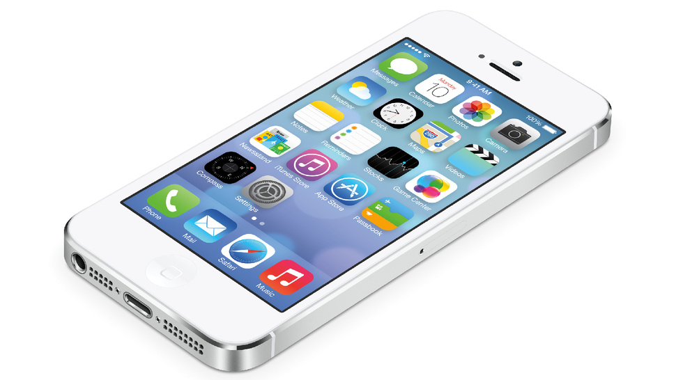
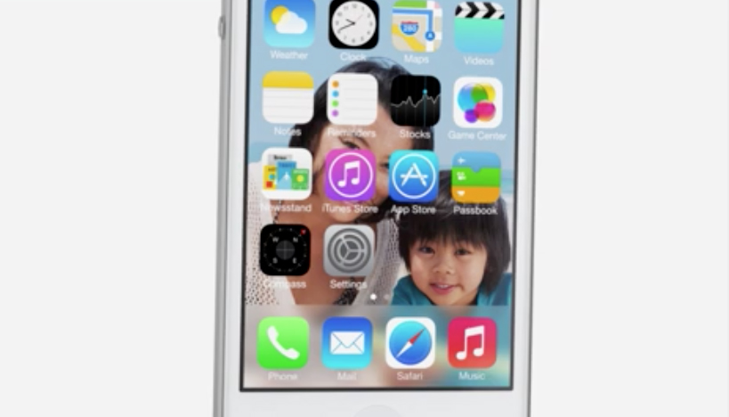
The Stock Apps
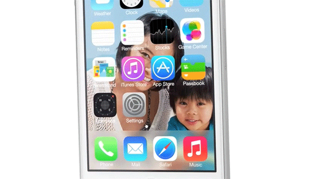
The new icons, just as we imagined, have lost much of of the reflectivity and depth of the old. The figures themselves have been given an update too: a rainbow-hued palette, and black-and-white backgrounds, make for a lovely little set of icons. There’s also a set of wire-frame-esque icons that appear on the blurred, layered background of the lock screen.
Like the new typeface, the icons borrow from a golden age of signage and typography design: the 1930s (and later, the 1970s), when an Austrian designer named Otto Neurath developed a visual language of pictograms called Isotype. His language was intended to transcend traditional language barriers using typographic symbols.
What does this have to do with the iOS 7 icons? Well, the original iOS icons borrowed their rounded edges and simple icons from pictograms — a heritage that’s been muddied by increasingly realistic details. By eschewing real-world visual cues for simpler, black-and-white icons, Apple is returning to its roots in pictograms and Isotype. In a way, we can understand this as Ive integrating a rich history of pictogram design into Apple’s design language.
If Cook and Ive had unveiled a super-simple, black-and-white iOS 7 today, this would be a simpler story. But rather than simplify, they’ve surgically removed outdated colours and details and replaced them with a series of new, complex UI cues. There are certainly some visual similarities between Android, and the solutions are similar to Windows Phone (that’s another post, for another time). But given the usage stats and customer loyalty that Tim Cook quoted in his introduction, the problems and solutions of iOS are unique. Rather than overhaul the system, they’re attempting to carefully introduce what amounts to a new kind of visual slang — if the original iOS was built for a 45-year-old newbie, iOS 7 looks like it was designed for a tween. It’s more grown-up in terms of functionality, but younger in terms of form.
Ive, in his introduction, hinted at the difference between simplicity and purity thusly: “Design isn’t just the way something looks. It’s the whole thing, the way something actually works, on so many different levels. Ultimately, of course, design defines so much of our experience. I think there’s a profound and enduring beauty in simplicity, in clarity, in efficiency. It’s about bringing order to complexity.” Order isn’t always simple — in fact, it usually tends to be pretty complicated.