Things change over time. Famous logos morph from black and white text into ornately embossed colourful graphics. Home screens go from a few icons to pages and pages. Phones go from bricks with numbers to slates with touchscreens. It’s just what happens. Little tweaks become overhauls. Just look at how your favourite soft drinks have transformed.
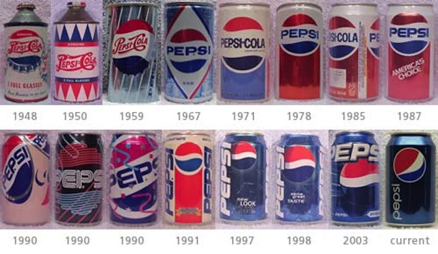
Though Pepsi gets a lot of crap for trying to find a logo that sticks and Coca Cola gets a lot of credit for having the same logo after all these years (other than the New Coke fiasco), both their soda can designs have changed dramatically from its humbly sweet beginnings.
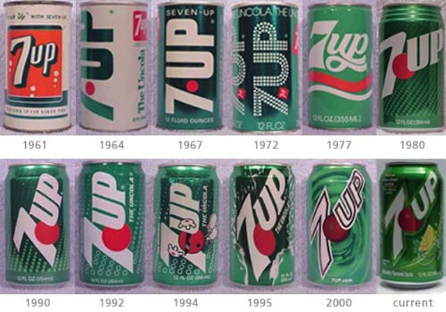
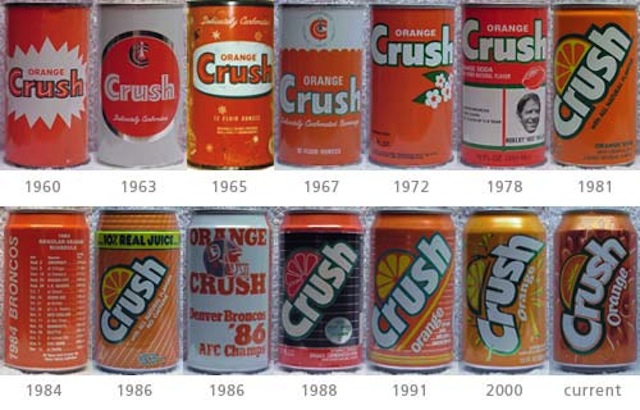
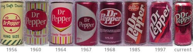
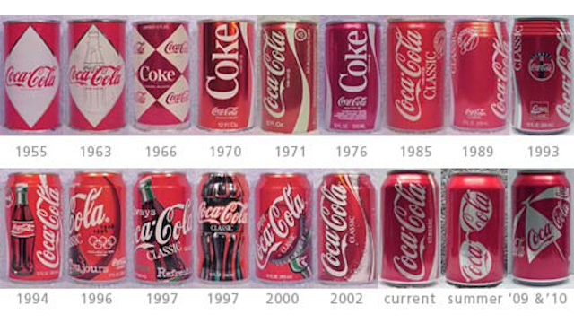
Bold Post culled together all these images of soft drink cans over the years ranging from a 1948 Pepsi to a 1964 7-Up and more. In the early years, it seemed like the design of the whole can changed a lot more frequently while recent years gave way more to little tweaks and additions.
My personal favorites? The 1971 Coca Cola. The 1978 Pepsi. 1972 7-Up. The 1981 Crush. And the 1985 Dr Pepper. See more soda can design changes here. [Bold Post via Design Taxi]