As you probably know from the media, Americans don’t all have the same accent. You knew this, but you’ve never seen the regional dialects of the United States dissected quite like this.
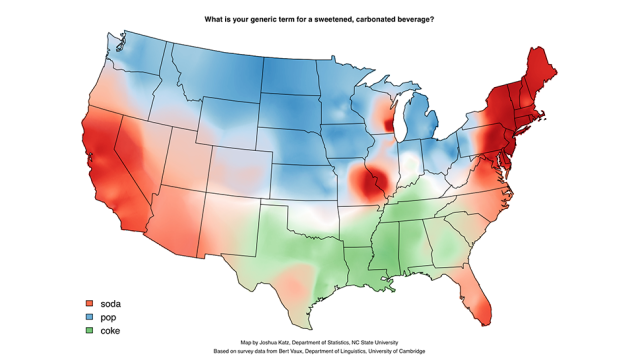
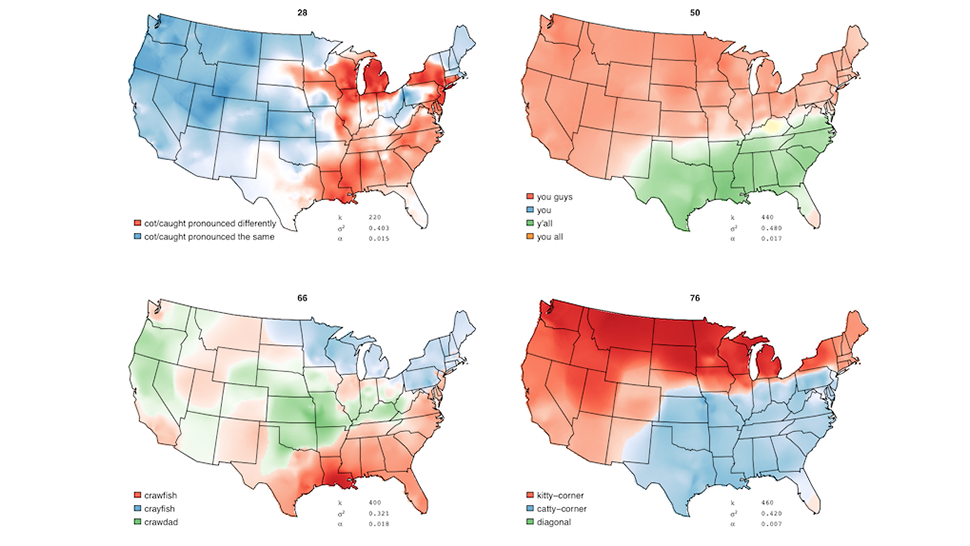
PhD student Joshua Katz, has applied some academic rigour to the old “soda, pop, coke” debate. Katz studied data from a 122-question survey examining the differences in how we speak across the country, plugging the that data into an interactive heat map displaying the answers to the many questions. (The interactive map is experiencing slowness and downtime due to huge amounts of traffic right now.)
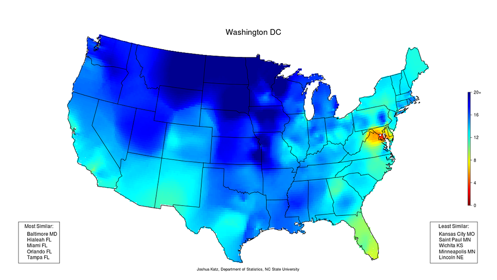
Katz also made a page that allows you to examine the aggregate dialect differences between one city and the rest of the country. For example, Barrett and I are from Washington DC, so I looked up the map below. Who know that we spoke so similarly to people in Florida? Wow.
This is a perfect example of how to make a really powerful visualisation that’s informative rather than gratuitous and silly. Katz’s work takes information that’s been abstractly planted in our heads and turns it into something we can understand. Kudos! [Joshua Katz via The Abstract via Reddit via Business Insider]