
You’d know a can of Budweiser anywhere. Like many other major brands, whether it’s Coca-Cola, M&Ms or BMW, Bud’s red and white packaging is instantly recognisable. It’s familiar, it’s safe, and it’s universally likeable. But recently Budweiser, along with several other ubiquitous beer makers including Miller Lite, Heineken and Sam Adams, have made major changes to their iconic packaging. Here’s why.
It’s time for Happy Hour, Gizmodo’s weekend booze column. A cocktail shaker full of innovation, science and alcohol. Bottles and cans, just clap your hands.
Over the past few years, the shelves of your local liquor store have become crowded with craft beer and artisanal ingredients. But Bud’s brand is all about being a comforting, unwavering staple. So why is it — along with a crowd of other major beer companies — changing?
Turns out there are lots of reasons. But before we get into the why, let’s take a look at the how. Because the next time you order your favourite cold brew, the bottle it comes in could be downright unrecognizable.
Miller Lite
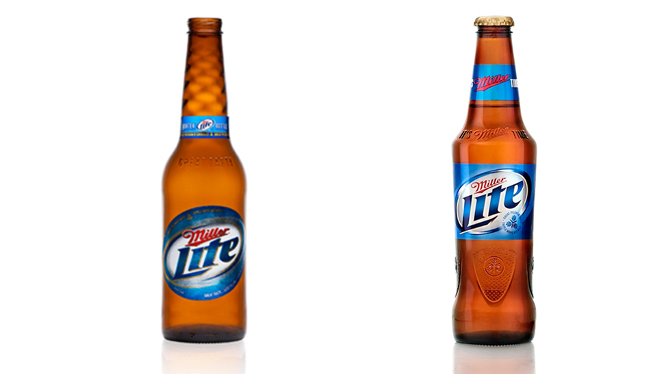
For the first time since 1973, MillerCoors has totally revamped the classic longneck. The torso of the bottle, so to speak, has been elongated, and the neck is slightly shorter. Miller design folks say that’s to make it easier to drink. It looks a little more streamlined — and loses the swirled neck that was added a few years back — but holds onto key elements like brown glass. The profile is similar, and the diameter is the same, but there’s also a new raised portion on the glass. Ever find yourself peeling off the label of a bottle? According MillerCoors’ packaging and design lead Charles Ho Fung, that’s called the “the fiddle factor”, the bottle’s proverbial comfort blanket towards which your fingers naturally gravitate. This new bit gives you something to fiddle with long after the label’s been torn to shreds.
Budweiser:
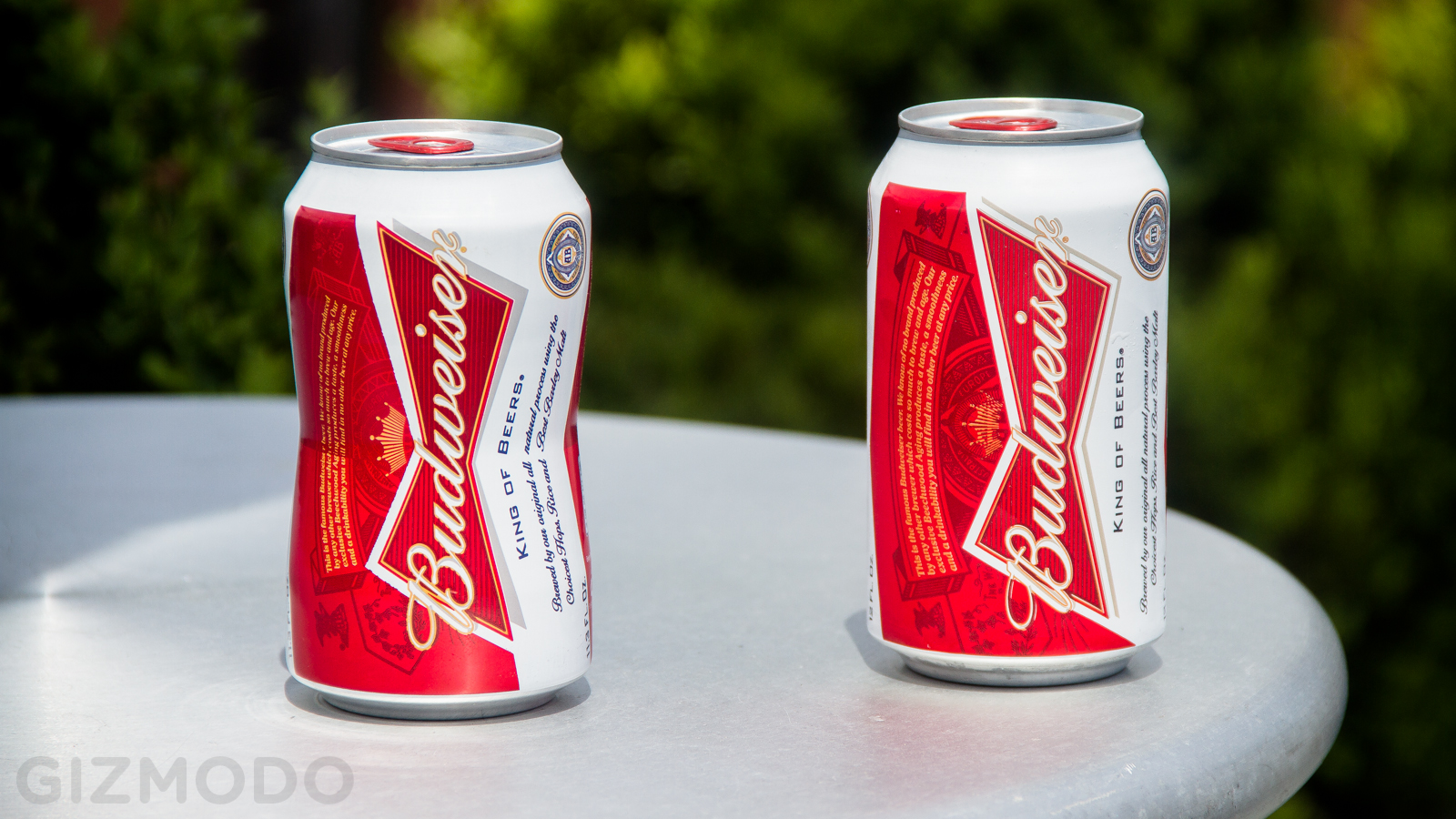
Budweiser, of course, has a number of different beers on the shelf, whether it’s good old Bud Light or Bud Light Lime or even Black Crown. The latest addition to that line is the same Bud classic that you know and love, but in a bow tie-shaped can that echoes the classic flared logo the company has used since the ’50s. The result is a can that’s puckered in the middle. It’s the same dimensions as other 350mL cans, but because its waistline is slimmer, you get 20mL less beer. Budweiser’s VP of Innovation, Pat McGauley, told us the bow tie cans are here to stay, they’ll be sold in an incremental eight-can pack that’ll fit on the shelves between existing sixers and 12-packs.
Heineken:
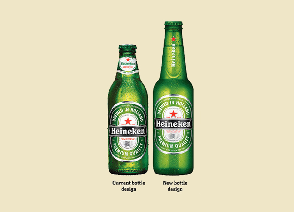
Heineken is ditching the squatty look of its old bottles for the first time in two decades. The new packaging for 350mL and 650mL Heineken and Heineken Light is called the Star Bottle. Its has stronger shoulders and a taller, slimmer neck. It also has a curved embossed star with the Heineken logo on one side. This is similar to the revamped Miller Lite bottle, in that it’s there for you to tinker with.
Sam Adams:
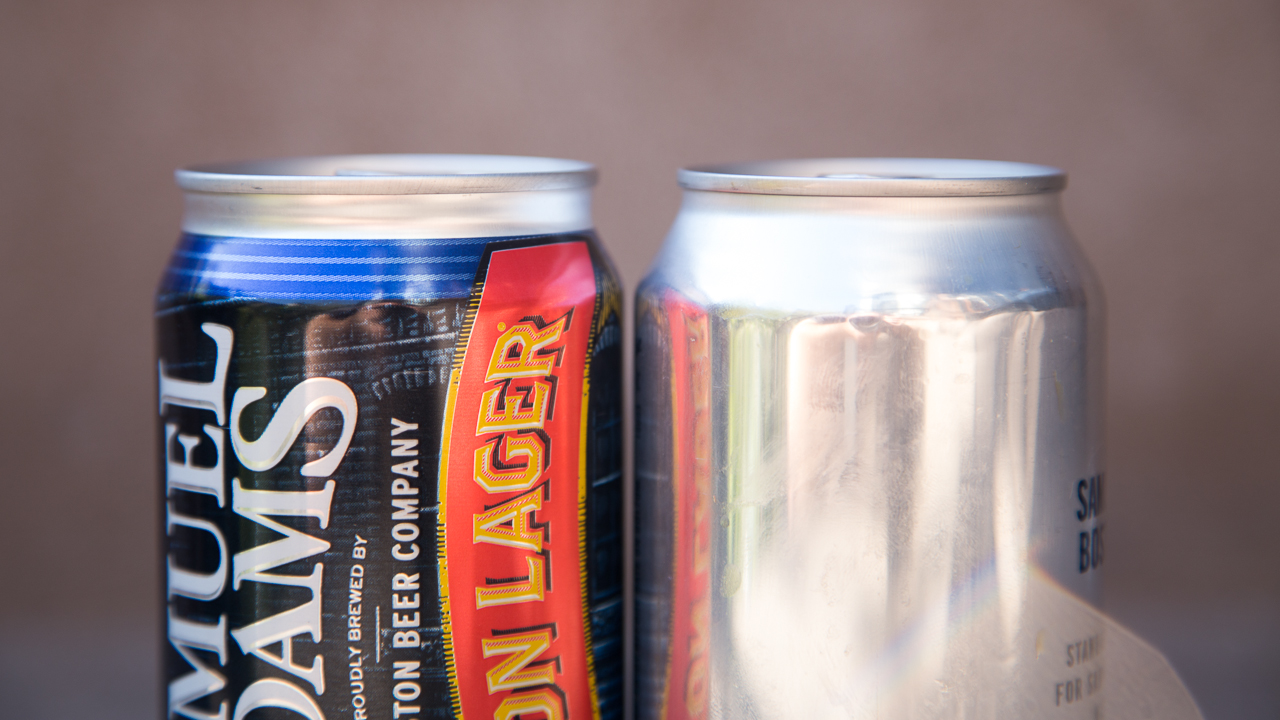
Sam Adams has a new can that’s supposed to more closely match the experience of drinking from a glass. This is the one redesign where flavour actually seems to be a major factor. Called the “Sam Can”, it has a flared lip and a wider top, opening up the air flow so you actually smell what you’re drinking. The differences are slight, but noticeable. The ridge where the can becomes the rim is also shaped differently. While most cans have a fairly straight profile, the Sam Can has a slight hourglass curve to it, bowing out at the top to accomodate the wider mouth.
New Form, Same Function
Now the why. Beer companies are fighting a war of attrition. They want to stay at the forefront of our booze-addled brains (and wallets) in a market that offers plenty of options with funky names like Dogfish and Magic Hat. Artisanal culture has introduced us to ingredients like apricot and chocolate, along with psychedelic new label and bottle designs — all of which scream hey! I’m not signing up for what the man is trying to serve me. The microbrew you’re drinking might have a lot to do with taste — but it also has everything to do with style.
“You hold a beer in your hand and it says something about you,” says Craig Dubitsky, founder of design-conscious household products company, Hello. “So how do you do that? You change how it looks. It needs to be sexier, it needs to be shinier, and it needs to be shapelier. The can says that you’re different and if you’re not different, your beer can be.”
Technological innovations through the years have been pretty limited as far as beer is concerned. In the beginning, cans were made from steel, then there was a move to aluminium. Then came the pull tabs, followed by the tab that stays on the packaging as you know it today. Brewing technology may have changed incrementally, but ultimately, beer is pretty basic stuff: alcohol, water, and hops. So instead, companies innovate on the aesthetic. On top of that, added Ho Fung, people just care about design more these days. “The new Miller Lite bottle came about because of the sensitivity of design with our consumers is going up — companies like Target, Apple, and Ikea increased accessibility to good design,” he said.
But in the end, it all comes back to staying relevant, being hip, and getting you to buy, buy, buy. Though you might not think about it when you’re running into the grocery store to buy drinks for a tailgate, but companies spend millions of dollars on strategies that play on your emotions. “When we can tie relevant iconic elements like Clydesdales, or like the bow tie into our core branding messaging, it drives a greater connection and creates an emotional bond,” Budweiser’s VP of innovation Pat McGauley said to Giz.
Ho Fung told us that the team at Miller Lite “identified that there’s a lot behind emotion and purchase intent. If we could illicit a positive emotional reaction from the consumer, we’ll drive purchase intent.” So, just like your average relationship, beer brands are trying to keep things interesting. To put it in romantic terms, sure, your longneck is wearing a fancy new party dress. But it’s not just intended to seduce you — it’s meant to keep you engaged in the relationship and coming back for more.
That explains why Sam Adams spent two years in ergonomics research and testing, and over a million dollars on its can. And why Budweiser spent three years and millions of dollars creating an entirely new machine and materials strong enough to mould the can into a bow tie shape. Look at it this way: Budweiser is the mainstream straight-laced boy next door your dad likes. He’s joined a band and gotten a tattoo and a $90 haircut in hopes you’ll date him. He’s still the same guy — he just has a new look.
Additional reporting by Brent Rose.
Top picture: Shutterstock/Yuri Arcurs