Workers’ compensation is a fairly new thing, dating only back to the Labour Movement in the early 1900s. Before that, injuries on the job were usually treated with either indifference or cheap payoff — after all, the average factory worker was making mere cents a day, so half a year’s pay was chump change for large companies.
But with worker rights came worker safety. And the problem of how to communicate it, if not every worker was literate. Vivid, often gruesome posters depicting the worst case scenario — electrocution, carbon monoxide poisoning, chopping of your thumb, etc — became the norm. A recent post on the illustration blog, 50 Watts, unearthed some excellent examples culled from a Dutch history archive.
It’s fascinating to see how styles changed as graphic design evolved. In the ’20s and ’30s, chemicals and electricity were anthropomorphised as literal monsters, ghouls and animals. But as the Bauhaus ethos and Swiss design entered the picture, danger became an abstract figure — a series of colours, typefaces and symbols arranged artfully on the page. Wonder which approach was more effective?
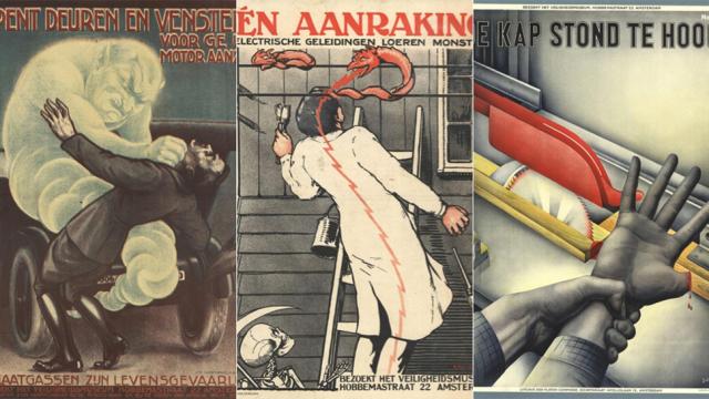
Open the doors and windows before you start the motor, from 1925.
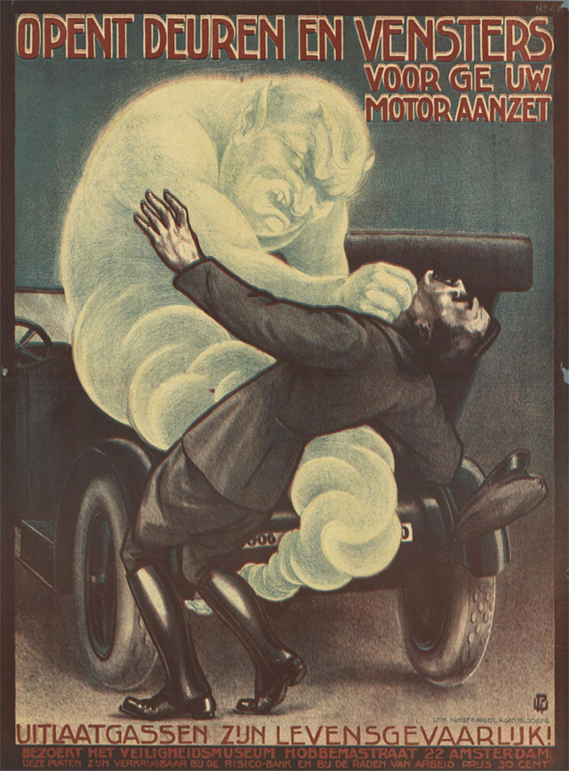
One touch. Monsters lurk on electric wires, from 1925.
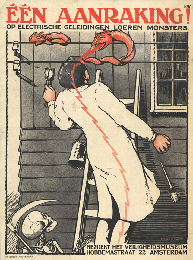
That’s what happens when the emergency door is barred! from 1926.
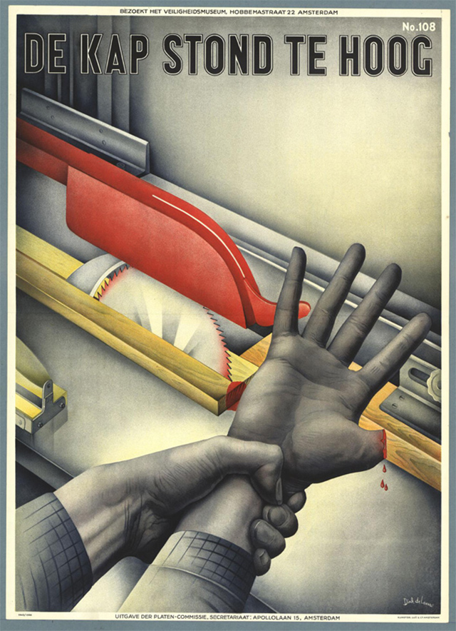
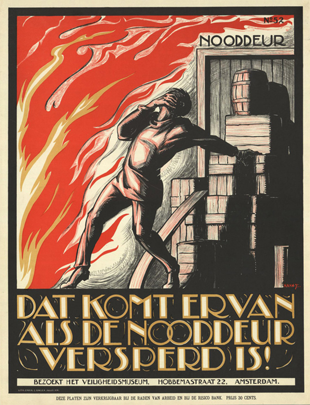
The hood was too high, from 1942.
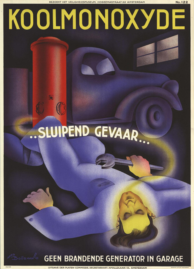
Carbon monoxide is an insidious threat, don’t run generators in the garage, from 1942.
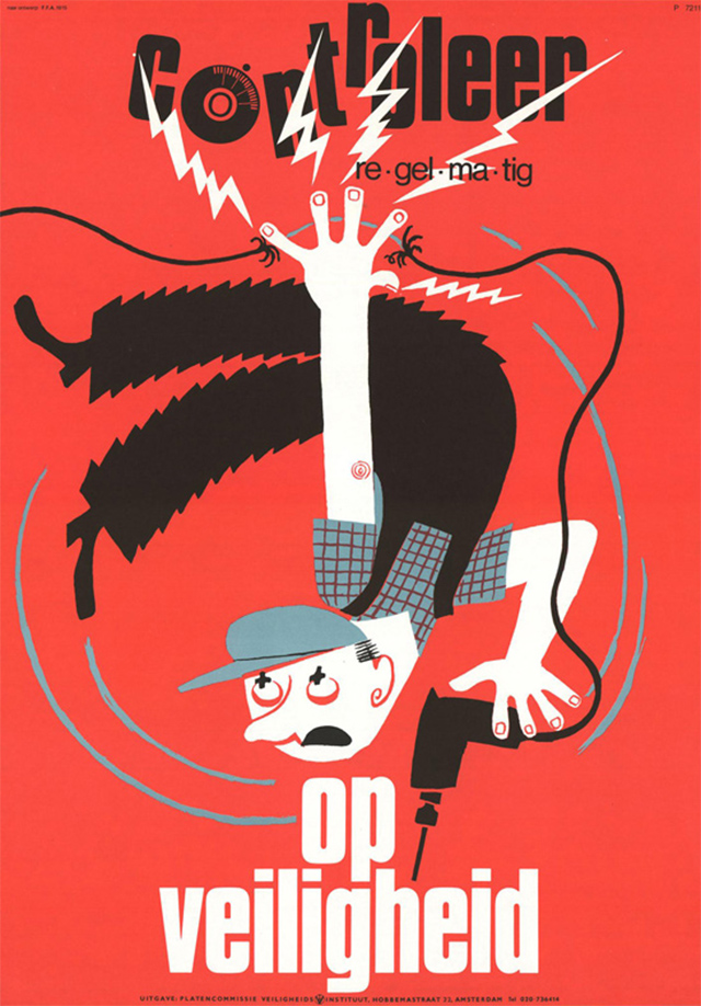
Regularly check for safety, from 1972.
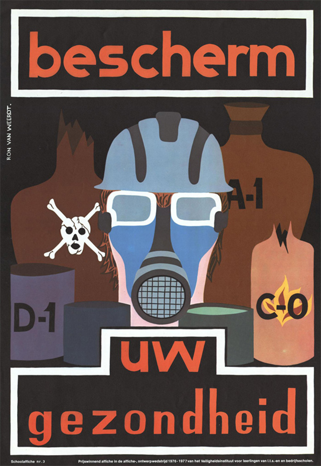
Protect your health! from 1977.