
This rationale has shaped the things on our screens since there’ve been screens to stare at: the desktop, the folder, the email icon that looks like a postal envelope. Vestiges of the physical world, even obsolete ones, are borrowed from to make computers feel less like alienating boxes and more like the good old days.
Apple used to hold itself, and its developers, to rules about copying the real, laid out in its Human Interface Guidelines, a handbook of computer/person love. Part of those rules? Don’t lean too heavily on the realism:
Think of the objects and scenes you design as opportunities to communicate with users and to express the essence of your app. Don’t feel that you must strive for scrupulous accuracy. Often, an amplified or enhanced portrayal of something can seem more real, and convey more meaning, than a faithful likeness.
In other words, make reference, but don’t slather it on.
The rules worked fine for decades! And, arguably, no giant company made prettier software on a consistent than Apple, ever. That is, until the company began taking the design advice of what can only be someone who stuck a syringe full of amphetamines into his neck and rode a horse straight into Cupertino.
They’ve smashed their own rules. Remember this, Apple? “Consider replicating the look of high-quality or precious materials. If the effect of wood, leather or metal is appropriate in your application, take the time to make sure the material looks realistic and valuable. For example, Notes reproduces the look of fine leather and meticulous stitching.” Your stitching looks like a dustbowl diaper. “In general, metaphors work best when they’re not stretched too far. For example, the usability of software folders would decrease if they had to be organised into a virtual filing cabinet.” Apple’s stretched its metaphors to the point of ripping.
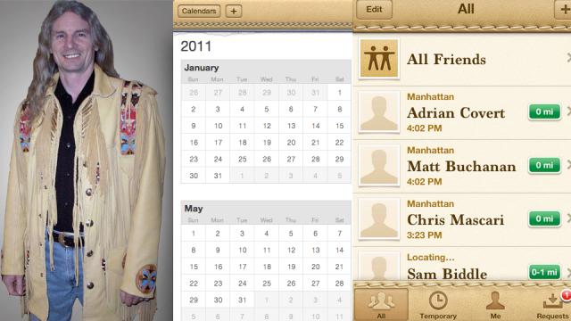
iCal looks like John Wayne’s daily ledger for Indian killing sprees, a heinous mash of leather-bound schlock and 21st century date-keeping. Who ever owned a calendar that looked like this? What is this appropriating? If I upgrade to iCal Pro will it come with animated beaded tassels? I don’t want my calendar to look like anything — I want graceful, minimal windows that put my schedule at the fore. I don’t want a pair of homeless shelter moccasins.
Game Center, the green felt iOS stepchild, is as ugly as it is neglected. It smells of plastic bottle whiskey. It looks soiled, tacky, and — Christ, what kind of old timey parlor did I walk into? Is this going to keep track of my Infinity Blade progress or ask me to play a game of pinochle and dominos? The geezer fonts! The chintzy banners! This is supposed to be the iOS Game Center, not Doc Hoolihan’s Goode Time Saloon. It runs contrary to every other part of iOS. It sticks out, it’s anti-functional and mind-boggling. Uniformity is Apple’s MO. Game centre is poison in the well.
And then… there’s Find My Friends, the newest visual atrocity from the Apple design rodeo. Unlike the antique iCal and Game Center, which at least take their cues from things that at one time existed (a lone cattleman’s notebook, an evening of backgammon at the nursing home), Find My Friends’ use of the stitched leather moccasin horror skin replicates nothing. Skinng a geo-locational social app like a Navajo sash isn’t just unpleasant to look at, it’s idiotic. It’s meaningless. There is literally nothing to take a visual cue from — it’s a concept that’s only existed for a few years. A map of your friends based on their GPS coordinates should be nothing more than that — no skins, no themes, just information. Placing the rawhide catastrophe onto a 21st century application is the antithesis of design: backwards, nonsensical, confusing, and fugly.
Why is Apple doing this now? Who put the company on this foul, cud-spittin’ trajectory? For the first time in, oh I don’t know, probably ever, Microsoft is displaying a keener aesthetic eye than Apple. Digest that. Both Windows 8 and Windows Phone 7 proudly eschew all skeuomorphism — any semblance to the real world is kicked in the Recycle Bin. The ultra-flat, super-contrasty interfaces of both are a triumph of digitalism. The New Windows, whether desktop or mobile, makes no attempt to look like anything in the real world. And it works wonderfully — both are beautiful because they embrace their pixels, not strive for faux woodgrain or marble or some other digital tromp d’oeil. Apple’s users are, increasingly, generations that can’t relate to these quaint analogies. I’ve never used an address book. I don’t need to be comforted by pseudo-fabrics. Apple itself said “In general, metaphors work best when they’re not stretched too far. For example, the usability of software folders would decrease if they had to be organised into a virtual filing cabinet.” And it’s done just that. Ugly, ugly hypocrisy.
So, will the next version of OS X be themed like an adobe hut? Will iChat be skinned like a telegraph? We hope these recent missteps are an instance of unbridled experimentation that resulted in a quick return to sanity — not a long trot into dusty eyeball hell. It’s not the first time Apple has gone ugly, but this is the most egregious. Yee haw… screw that.


You know, the first time I looked at an iPhone this is exactly what struck me. There is nothing slick and integrated about how an iPhone's UI looks at all. That's why I've been saying for some time that WinPhone 7 is much more Apple-like than iOS. Yes, Metro is a completely different look, built around typography, but it is very consistent and it's minimalist/Bauhaus aesthetic is beautiful, as is Quicktime. OTOH, iOS looks like something out of the Fisher-Price design lab. It is just awful.
The question you have to ask is if Apple is becoming a victim of its own success and if Microsoft are actually benefiting from their new-found status as underdogs? I think the answer is pretty obviously "yes" to both.
I'm sorry MotorMouth, when was the last time you looked at an iPhone, let alone used either iCal or the new iOS5 Find my Friends. That's what I thought. I'd like to think of Gizmodo as a cutting-edge tech blog where intelligent people come for breaking news and related discussion. By posting your irrelevant mental diarrhea you are not actually contributing anything. Your pre-typed vitriolic comment has been waiting for some relevant Apple-centric discussion to pop up, much like you, and here we are. Again. I, and most of the readers here I'm sure, get that you're not into Apple. Maybe you could save yourself a little anguish by not reading Apple related posts in the first place (hint: it's usually in the bold headline at the top)
It's Motormouth. He'd literally be standing on a soapbox in the street calling people to repent their non-WP7 sins if he thought he could get away with it.
You say that but I can guarantee that I went through a far more objective process before buying my phone than you did with yours. How much time, for example, have you spent with WinPhone 7? I spent quite a bit of time with iOS side-by-side before I formed an opinion and the very first thing I noticed was how un-Apple like the UX is, how overdone and unsubtle and what a mish-mash of styles.
Rereading the article, I see nothing confining the comments to iOS 5 or just to those features. As a graphic artist with some UI design experience, it just happens to be a subject that interests me. Sorry if that chafes against your fanboyism.
jamall, what did you own 'verbal diarrhea' contribute? I think MotorMouth is spot on and makes a far more intelligent addition to the comments section than yourself, maybe try and discuss the topic rather than another user posting their own opinion?
There are a couple of programmes where this is true and it really annoys me. Find My Friends and the new Calendar (esp in Lion) are both awful. They need to lose the faux leather look.
Where can I get that jacket!
Finally, somebody posted something about the terrible design cues apple has been undertaking of late. Hopefully Cupertino listens
I absolutely detest the new music icon in iOS5. It's shades of daggy orange are like a 1970's Hawaii sunset postcard and why is the brown musical note placed in such an unbalanced position? I much prefer the clean lines and colours of the original iPod icon. Apple fail.
I could not agree more.
I am not an elitist graphic designer. I'm simply a consumer that has been a long time Apple customer. For the most part I love their products.
That said, I was so shocked at how hideous the new music icon is on my brand new 4S that I went to google to see if others felt the same way. (which led me here)
I am flabbergasted at the recent poor design decisions.
How ANY sizable group of Apple employees could possibly have seen the new desktop ical skin and not staged an outright rebellion is beyond me.
I only thank the digital gods that it wasn't included on my iPhone as well, because thankfully that is the only version of iCal I use.
It seems as though there are two design sensibilities pulling in different directions and it's causing absolute design discord.
With OS X they put forward a space faring futuristic marquee with the 2001-esque Monolith inspired X backed up with a default desktop image of stars meeting the aurora borealis.
They've continued this theme with each successive iteration of the 10.x OS.
It's the future. It's exploring the reaches of what we know and see. It's space age. I get it, so does everyone else, and most importantly, it works.
On the other hand as we march forward towards an ever more digital future, I can almost hear the conversations that led to putting familiar terrestrial "comfort" textures on things. "Let's help people feel homey, and keep them from feeling that technology is cold and sterile".
It's a fine theory, but the execution is a travesty.
You want iCal to be reminiscent of a desktop blotter and calendar? Fine. But at least model it on something modern, classy, and sophisticated. Instead it looks like it was bought at a Wild West theme park gift shop.
Goodness gracious now that you've pointed out that its positioned awkwardly I can't stop looking at it!
This article is spot on and it's worrying
The brown things on my iPad are fugly.
Compare the "bookshelf" or "newsstand" to Kindle....the apple stuff looks like someone crapped on the screen
lol correct that is, read it couldn't i either.
Glad I wasn't the only one thinking wtf when I saw that
And the linen blind background for notifications. Agree they need to rope this trend back into the future.
Think different. Anybody?
I had trouble following yur point in his article. ecause it takes several paragraphs before you actually describe anyhing I've seen on my iPhone.
but yes I agree it is scary to think that game centre or find my friends got past Jonathan Ives. I understand he can't. e everywhere at on e but Holy Christ.
it is still the best UI out there though. I javeto say it does bug me that I can't remove the background images on my phone and just have black. and there's something about the application manager where you see all your running apps that bugs me too. the cheesy attempt at brushed steel. and the confusing double hit home to access don't hold down or you get siri.
I would love to be able to re-skin these things to make them look nicer. *dreams*
Hear, hear! Very well written and right on the money. I found this article by searching to see whether I was alone in my thinking that Apple is on the wrong path here. This is a depressingly bad design idea.
As if the battery drain of Find My Friends were not reason enough to delete that app.
Ah, this old classic!
It makes good points- While Apple is a decent company for producing competent subtle industrial design and slick programming, their graphic design choices are all over the place. What I dislike most is the stuff they use for promotion: the brushed steel look with water droplets for the iphones and ipdads looks childish and ugly, and the purple aurora for the Macbooks and screens is revolting and very, very tried.
I almost completely agree with the article, but NOT MotorMouth or the guy that hates him so much. The faux leather is HIDEOUS and completely meaningless everywhere it is presented. It is a serious lack of taste on the part of whomever is in charge of it. That said, iOS overall is stunning and a breakthrough in graphical interface design, and that which the overly futuristic windows phone people are trying to distinguish themselves from. The mimicry of physicality in iOS is the pillar of its success...it requires no learning whatsoever, while windows phone and android lack the same subtle cues and fluidity of experience for majority of people, excepting tech nerds who really shouldn't be allowed to design user interfaces to begin with. This is a piece of advice Google should especially take into consideration, because no offense, an aptitude for programming techniques and algorithms most often indicates not only a lack of expertise in design matters, but a near total ineptitude for it.