Does The New Xbox 360 Dashboard Look Familiar To You?

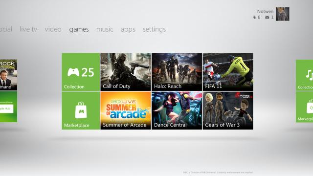
This spring, the Xbox 360 gets a sexy new dashboard update, giving the service a look and feel that should be incredibly familiar to both Windows Phone 7 owners and folks that have gotten a peek at Windows 8.

Microsoft is in the midst of a torrid love affair with squares and rectangles. They put content into squares. Then they pack those squares into rectangles. Then they make bigger rectangles out of those rectangles. I get it. I understand the attraction. I’m a big fan of boxes myself. They are a fine way to organise things.

I suppose it’s about time that Microsoft begin presenting a united front. This is what the Windows Phone 7 interface wants to look like. It’s what the new touchscreen tablet and PC version of Windows 8 looks like, so by gum it should be what Xbox Live looks like.

Republished from Kotaku

Discuss

(10 Comments)
  • [–]

    Stewart Walker

    Tuesday, June 7, 2011 at 10:29 AM

    I think this is great news. MS has needed a joint look and feel for a long time and I’m glad to see it happen.

    Whether it be good or bad, it’s about time.

  • [–]

    Travis

    Tuesday, June 7, 2011 at 11:10 AM

    Well since the anti-trust has been finished you see MSFT is really starting to push what every other company has been allowed to do for years. merge and connect their own products.

    • [–]

      Stewart Walker

      Tuesday, June 7, 2011 at 12:00 PM

      haha, so true. It’s a shame that the EU doesn’t go after Apple and google for the same thing. Hell, Chrome OS is basically a OS Browser.

  • [–]

    Cameron

    Tuesday, June 7, 2011 at 11:14 AM

    So. Much. White……

  • [–]

    Steve

    Tuesday, June 7, 2011 at 2:07 PM

    I kind of like the addition of Youtube; according to the Fall,2011 – system update.

  • [–]

    glittalogik

    Tuesday, June 7, 2011 at 3:57 PM

    I hope this means they’re entering the 21st Century and throwing in some smooth scrolling for media screens. Navigating through hundreds of files is needlessly clumsy, especially compared to a mature UI like the PS3 or any of Apple’s media/TV products.

    • [–]

      adam

      Tuesday, June 7, 2011 at 5:53 PM

      lol PS3 has the worst UI

  • [–]

    Ash

    Wednesday, June 8, 2011 at 9:53 AM

    Me likey.

  • [–]

    Tyler

    Friday, June 10, 2011 at 10:56 AM

    I hope you’ll be able to customise all of the colors, both the tiles and the background.
    But this new UI looks harder to navigate with the controller .. ?

  • [–]

    Tristan

    Tuesday, June 7, 2011 at 12:32 PM

    Only if you can change it to any other colour..

Join The Discussion